Wellness sub-brand for Healthcare Company
Want to win a job like this?
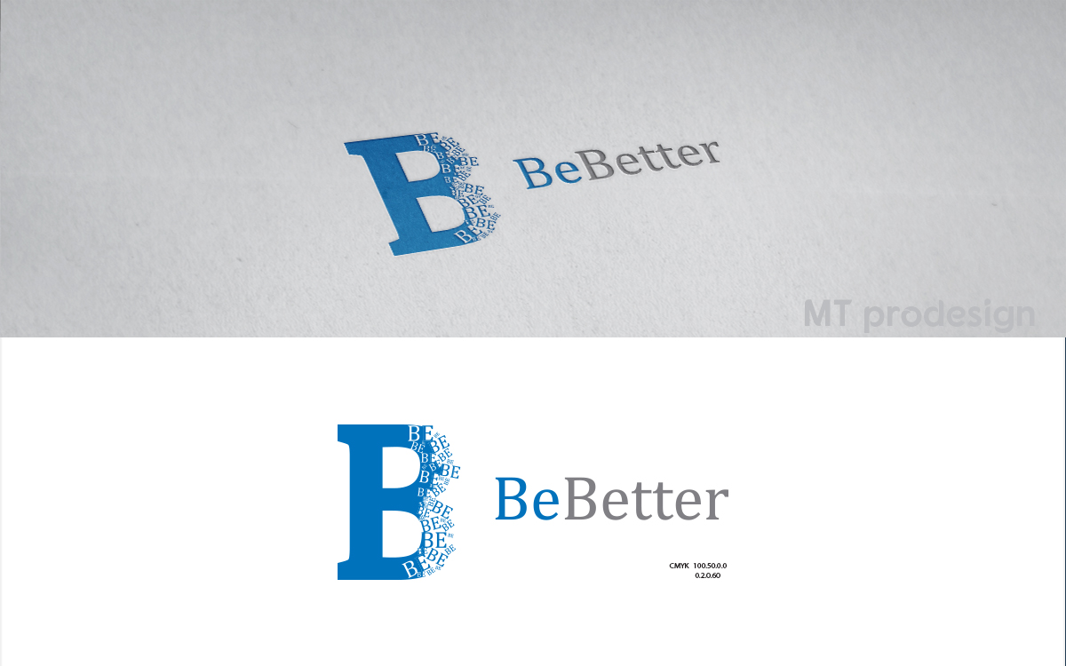
This customer received 184 logo designs from 74 designers. They chose this logo design from MT as the winning design.
Join for free Find Design Jobs- Guaranteed
-
 US$360
-
 184 designs
-
 74 designers
Logo Design Brief
As an organization, we use "Be ____" as a standard nomenclature and as part of our value system. We would like to create something in order to propose a new wellness platform we are producing internally to our Board. The sub-brand is "Be Better" and we would like to play off the fact that the first two letters are the same and have "BE" stand out given that is our corporate standard. It could be a shadow, subset of the original "BE" or something playing off the corporate block letters as the font should stay somewhat traditional
Target Market(s)
Internal employees and partners
Industry/Entity Type
Healthcare
Logo Text
Be Better
Logo styles of interest
Wordmark Logo
Word or name based logo (text only)
Font styles to use
Colors
Colors selected by the customer to be used in the logo design:
Look and feel
Each slider illustrates characteristics of the customer's brand and the style your logo design should communicate.
Elegant
Bold
Playful
Serious
Traditional
Modern
Personable
Professional
Feminine
Masculine
Colorful
Conservative
Economical
Upmarket
Requirements
Must have
- simple text using "Be Better" and some type of mirror image, shadow, or something that emphasizes "Be". Must use blue, black, grey or white as this is our central palate
Nice to have
- Memorable!
Should not have
- Any wellness imagery that is "typical"