Clean, Professionally-looking Label Design for Yogurt Cup for the Chinese Upmarket
Want to win a job like this?
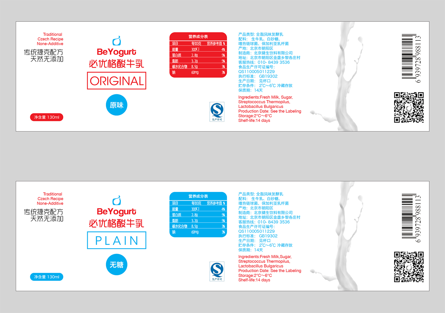
This customer received 57 packaging designs from 12 designers. They chose this packaging design from huihui as the winning design.
Join for free Find Design Jobs- Guaranteed
-
 US$200
-
 57 designs
-
 12 designers
Packaging Design Brief
We are a start-up industrial-food business based in China. We created a food series called the "Be" series. Basically, It's a series of food products that is made in the most plain and original way. It sounds nothing exciting but it is a very bold idea in China considering the amount of additives are put in the food.
This project is a label design campaign for our "BeYogurt". We have been selling this non-additive pure yogurt (sweetened and non) for half year and now we have an opportunity to pitch for the convenience store chain "711". Therefore we decided to develop a new packaging for convenience stores. The package is going to be 130ml PP plastic cup. The cup is going to be transparent, so can be the label. The overall feeling we are going for is simple, clean, but professional enough to make it an consumer product. It might be also useful to mention that we used a traditional Czech recipe to make the yogurt, the idea of which can be also touched upon on the design.
We will launch the two plain flavors first (with sugar and without), then we will add our fruit-jam series in about half year time. So this time will be the sweet and non-sweet plain yogurts first.
For the cover of the cup, we will use a round aluminium foil. (also open for designs)
There also be a section reserved for the bulky product information, which is in the psd file as well under "existing label"
Old-product picture(on the shelf), logo(we will stick to), and the new cup we are going to use are attached for reference. We also attached some designs we like.
PLEASE refer to the examples, these speak the feeling of our new product.
The measurements are:
top circumference: 188mm (where the ridge or bump is)
bottom circumference: 166mm
height: 50mm
Updates
Project Deadline Extended Reason: Production deadline extended for a better design. Added Tuesday, October 27, 2015
Target Market(s)
China
Industry/Entity Type
Business
Look and feel
Each slider illustrates characteristics of the customer's brand and the style your logo design should communicate.
Elegant
Bold
Playful
Serious
Traditional
Modern
Personable
Professional
Feminine
Masculine
Colorful
Conservative
Economical
Upmarket
Requirements
Must have
- 1. Our logo graphic in its original way. However, the font of the texts "BeYogurt" can be changed, and the logo can also be placed vertically if necessary.
- 2. Clear differentiation between the two flavors (sweet and non-sweet plain)
Nice to have
- 1. Real photos (portraits, fruits, landscapes, architectures, nature etc) CREATIVELY edited as background or decorations.
- 2. Real hand-writings for example our slogan "本该如此"
- 3. While or Plain background
- But really, above are not necessary requirements! These suggestions shouldn't affect your creative planning.
Should not have
- Cartoon images unless it's hand-drawings with an antique or modern feeling.