Retail & Restaurant co-branding concept logo
Want to win a job like this?
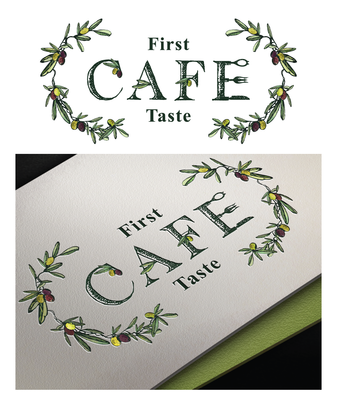
This customer received 176 logo designs from 24 designers. They chose this logo design from Elza as the winning design.
Join for free Find Design Jobs-
 US$160
-
 176 designs
-
 24 designers
Logo Design Brief
We are an Ultra premium Olive Oil and Vinegar Retail store with an established logo that has expanded with a Cafe (restaurant) inside the retail store. The Cafe serves modern International food in a relaxed restored historic building that incorporates the products available for retail. Our tableside service directs the guests to "play" with their food by seasoning and garnishing with the Oils & Vinegars. We would like to see designs that demonstrate a connection between the retail and Cafe but allows the Cafe to stand on it's own with a logo that is more suited for restaurant and not retail.
Updates
Project Deadline Extended
Reason: Working on some revisions with in the designs submitted
Added Friday, May 20, 2016
Target Market(s)
25+, health conscious, eats out regularly, destination oriented
Industry/Entity Type
Restaurant
Logo Text
First Taste Cafe
Logo styles of interest
Emblem Logo
Logo enclosed in a shape
Pictorial/Combination Logo
A real-world object (optional text)
Abstract Logo
Conceptual / symbolic (optional text)
Character Logo
Logo with illustration or character
Lettermark Logo
Acronym or letter based logo (text only)
Font styles to use
Other font styles liked:
- ereshkigal
Look and feel
Each slider illustrates characteristics of the customer's brand and the style your logo design should communicate.
Elegant
Bold
Playful
Serious
Traditional
Modern
Personable
Professional
Feminine
Masculine
Colorful
Conservative
Economical
Upmarket
Requirements
Must have
- See attached sketch and images. An Olive spoon & fork are attached along with two separate ideas for logo. The first one is the Olive spoon that should appear to be engraved with "First Taste" using the font supplied (Ereshkigal) with "Cafe" in the spoon opening. An olive branch for the handle. The second concept is drawn out with olive branches, olives and "first taste" incorporated into the letters. Style should be either a water color, portait or illustrative style. We would like to see both of these interpreted.
Nice to have
- something besides an olive that is over used for this concept like an olive oil tasting glass
Should not have
- The same font used in the Retail logo