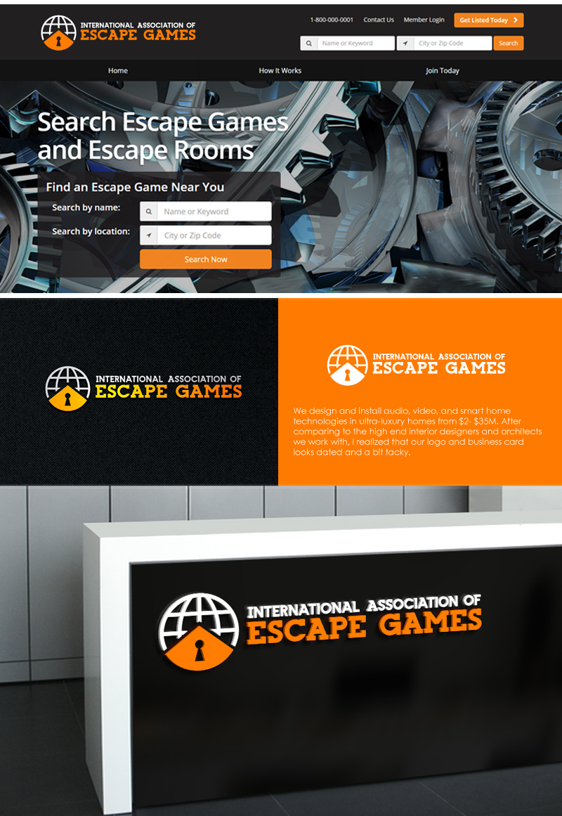
International association of escape games
Want to win a job like this?
This customer received 178 logo designs from 33 designers. They chose this logo design from BehindSymbols as the winning design.
Join for free Find Design Jobs- Guaranteed
- Bundled Project 1
-
 US$320
-
 178 designs
-
 33 designers
Logo Design Brief
We are a trade organization for escape games (this is a fun family , friends or corporate event activity where people are locked in a room and they try to escape ) , we have more than 1,000 members , all of which are escape games in different parts of the world. Our goal is to develop a logo that is good for the entire industry, very inclusive and fun.
Target Market(s)
This is a trade organization , so we are marketing to other businesses, mainly escape game businesses.
Industry/Entity Type
Tourism
Contact Information for Business Card
Can use partial acronyms like....
IAEscape Games
or
IAEG
or the full name
International Association of Escape Games
Logo Text
International Association of Escape Games
Logo styles of interest
Emblem Logo
Logo enclosed in a shape
Abstract Logo
Conceptual / symbolic (optional text)
Font styles to use
Colors
Colors selected by the customer to be used in the logo design:
Look and feel
Each slider illustrates characteristics of the customer's brand and the style your logo design should communicate.
Elegant
Bold
Playful
Serious
Traditional
Modern
Personable
Professional
Feminine
Masculine
Colorful
Conservative
Economical
Upmarket
Requirements
Must have
- Logo needs to be designed horizontally to fit on our website properly (short & wide). Please visit http://www.internationalassociationofescapegames.com to see how your logo's shape would fit.
- We would like the option of both vertical & horizontal versions, but we need a horizontal version to fit on the website.
- Graphic element should be on the simple side rather than very detailed.
- After discussing the style with our Board, we have decided to go with a more contemporary Black/orange/white color scheme rather than red/blue. Our website will be changed soon to reflect this new design direction.
- I would really like to use similar fonts that this one designer used in an earlier mockup: https://www.dropbox.com/s/bsnu23da7n7fiuu/Screenshot%202015-11-11%2014.19.50.png
Nice to have
- Globe, world, map, lock, key
Should not have
- should not be busy or hard to read when small.
Payments
Total
US$320
Project Deadline
13 Nov 2015 13:19:53 UTCProject Upgrades
Bundled project(s)
- offering US$80 business card design to winner