Designers, start your creative engines: marketing enterprise needs identity
Want to win a job like this?
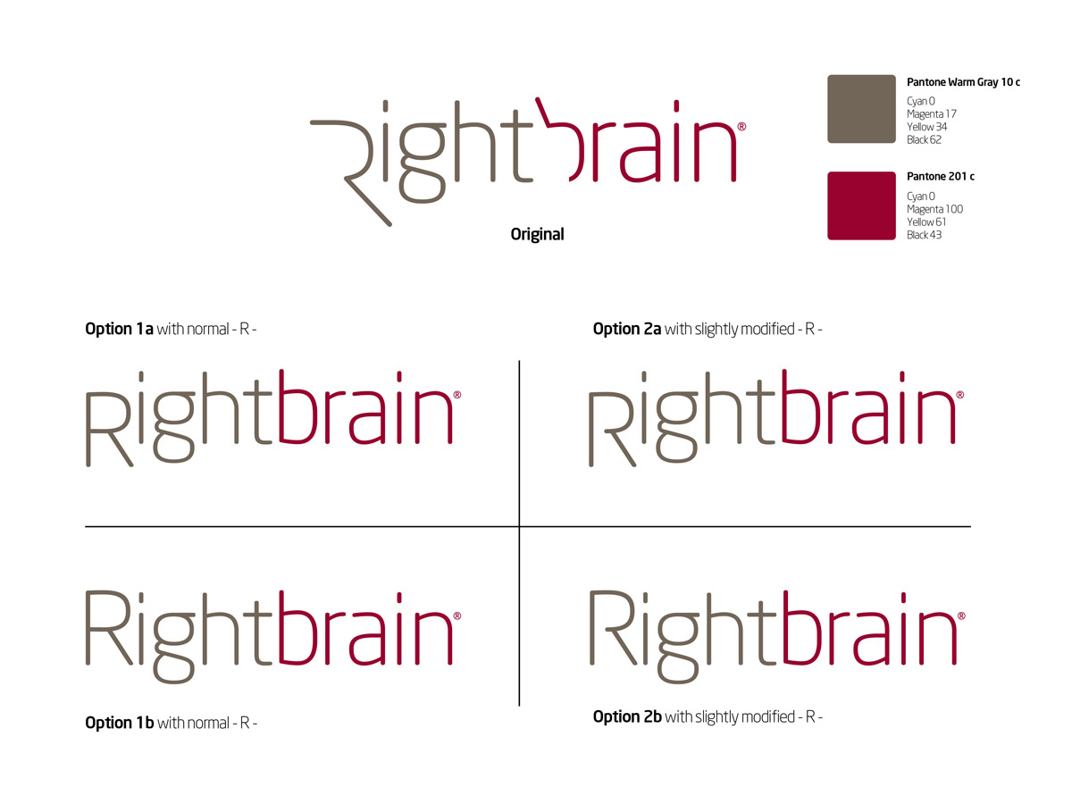
This customer received 501 logo designs from 109 designers. They chose this logo design from Lewis as the winning design.
Join for free Find Design Jobs- Guaranteed
-
 US$650
-
 501 designs
-
 109 designers
Logo Design Brief
***SEP08***
Brief of a brief of a brief...
When people see my logo for the first time (and if it's really that cool, then every time!), I want them to feel like this marketing firm is...
Savvy yet not stuffy,
Cool yet not childish,
Marketer definitely not lawyer,
Out there yet not outrageous,
Simplistic yet not plain, and most of all...right brain CREATIVE.
******
I recently acquired an established Canadian marketing/publishing company. For 25 years, it successfully offered direct marketing services and publishing collateral for Canadian pharmaceutical manufacturers.
The company is in dire straits of a complete brand makeover. Not just a simple nip & tuck, we are talking about a full body job starting with a new logo for a new name; introducing Rightbrain Marketing (yes, Rightbrain in one word).
Initially, I'll continue to offer the same services customers have long been used to. Gradually though, the strategy will be to move up the "food chain"; from commodities services to advisor as a high value partner.
The pharmaceutical manufacturers are, in general, not necessarily progressive from a marketing point of view. They can’t be, considering their own market. My competitors and most of the industry suppliers are, by association, also conservative. At best, their image is contemporary. I want and need to, be different. Not quirky; I’m not a software start-up or consumer company.
The statement I’m looking from my customers is; "Wow, now these guys look like pros" when they see my image (business cards, web, etc.). It must exude of creativity. So, a profile of a head with a brain in the logo would be too obvious, too typical, unless it is very creatively done (and not obvious). It must be simple. And please NO SWOOSH (BTW; my definition of swoosh is the arc of circle like rings of Saturn), or GLOBE type derivatives of any kind. The “look and feel slider” was very carefully chosen. If you include designs with the word “Rightbrain”, please not the word “Marketing”.
Colours should be executive elegance (not stuffy!) like a dark charcoal grey or black background with one other brighter colour. But this is strictly a suggestion. Since my industry still uses fax a lot (yes, it still does!), it must be able to transmit well in this medium (assume then no gradient). The new logo will also form the basis for the rest of my graphical brand.
I created my current name, logo and graphics for my other consulting company (www.symbeyon.com). This probably gives you a good feel for my design "type".
Lastly, I've attached logos from Creattica that "hit" me so that it may give you another way to tell you what I like.
Well, that’s it. Thank you for participating and I simply can’t wait to see your designs.
***07SEP***
I'm realising that I do not like logos with the initials "RB" since it presumes my company name is two separate words, which is not. I've received many designs with a reverse "R" with a "B" and I'd like to stay away from this.
Also, again with so many submission, that I would prefer to see the spelling as "Rightbrain" as opposed the "RightBrain" but you can make each "word" different font or colour or even "RIGHTbrain" to distinguish the two but it is one single word.
******
Updates
Hi Everyone,
Thank you for all your submissions to date. Those of whomhave sent designs up until this past Saturday know that I have been forthcomingwith detailed feedback. However, as many of you “know the game”, the flood ofnew concepts in the last few days can be overwhelming.
In light of the fast approaching deadline (and I do not wantto extend it), I can no longer provide feedback on designs that I eliminate. Onlythose that I feel might have potential will be kept and possibly sent my feedback.
Thank you,
Added Monday, September 12, 2011
Everyone,
Added Saturday, October 08, 2011
Project Deadline Extended
Reason: See broadcast to all Designers. Claude
Added Saturday, October 08, 2011
Hi Everyone,
Added Tuesday, October 11, 2011
Added Monday, November 07, 2011
Project Deadline Extended
Added Monday, November 07, 2011
I have had a great deal of responses which is very encouraging to continue using DesignCrowd as my design service center.
Added Monday, November 07, 2011
Target Market(s)
Strictly pharmaceutical manufacturers dealing with marketing and sales department directors
Industry/Entity Type
Pharmaceutical
Logo Text
Rightbrain
Logo styles of interest
Emblem Logo
Logo enclosed in a shape
Pictorial/Combination Logo
A real-world object (optional text)
Look and feel
Each slider illustrates characteristics of the customer's brand and the style your logo design should communicate.
Elegant
Bold
Playful
Serious
Traditional
Modern
Personable
Professional
Feminine
Masculine
Colorful
Conservative
Economical
Upmarket
Requirements
Should not have
- No swoosh of any kind
No globes of any kind
No crosses to signify the medical field
***New 7Sep*** No logos with "RB" (see brief)