Rebound Rehab needs bold and simple logo design
Want to win a job like this?
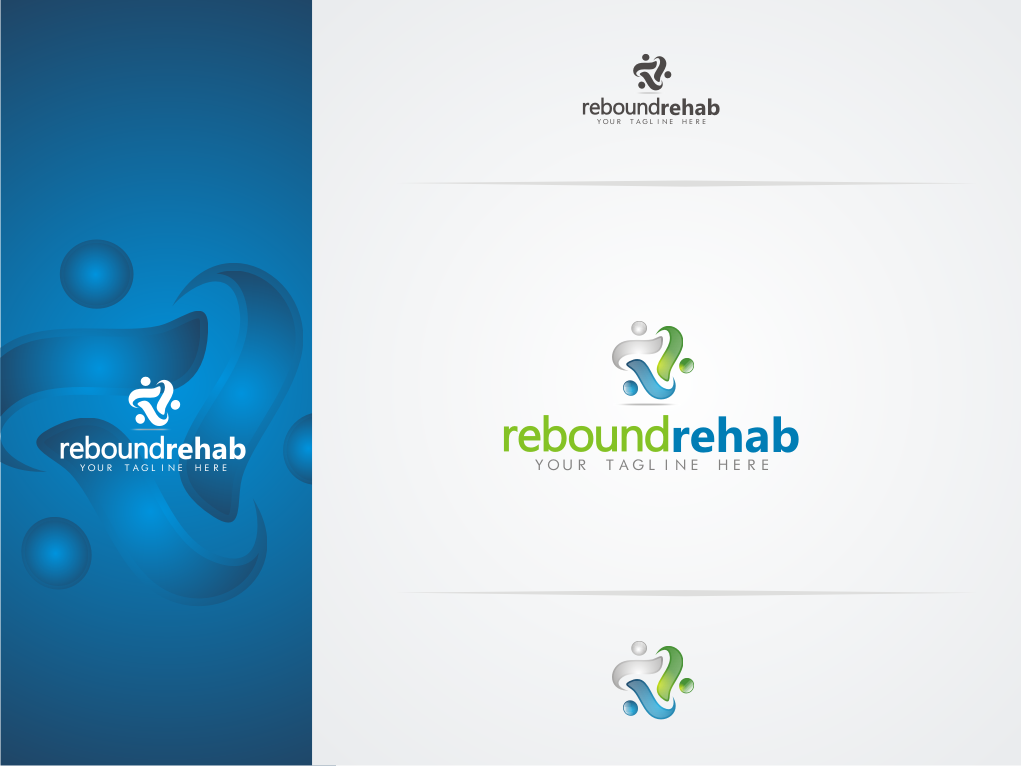
This customer received 63 logo designs from 22 designers. They chose this logo design from ikanteri as the winning design.
Join for free Find Design Jobs- Guaranteed
-
 A$400
A$400
-
 63 designs
-
 22 designers
Logo Design Brief
Rebound rehab assists people return to work and life following motor vehicle and workplace accidents via occupational therapy assessment and therapy services. This can also include other allied health assessments and case management services. At Rebound Rehab we provide a client centered model of service.
Rebound means to recover from adversity and the logo will need to encompass this concept.
Our competition includes companies such as Recovre and AWWorkwise.
The final design will need to demonstrate progress, trust and recovery.
Updates
Project Deadline Extended
Reason: Soo many last minute designs!!! Very excited not long now!
Added Thursday, September 08, 2011
Hi All,
Thank you for all the great designs. I am going to narrow the field to the top three designs. Any last minute designs please forward ASAP.
Kaye
Added Tuesday, September 13, 2011
Target Market(s)
The audience includes legal professionals, Insurance companies, employers and injured people themselves.
Industry/Entity Type
Health
Logo Text
Rebound Rehab
Logo styles of interest
Pictorial/Combination Logo
A real-world object (optional text)
Abstract Logo
Conceptual / symbolic (optional text)
Wordmark Logo
Word or name based logo (text only)
Look and feel
Each slider illustrates characteristics of the customer's brand and the style your logo design should communicate.
Elegant
Bold
Playful
Serious
Traditional
Modern
Personable
Professional
Feminine
Masculine
Colorful
Conservative
Economical
Upmarket
Requirements
Must have
- The logo will need to look great in color and grey scale and be easily transferable to a letter head, business cards and email signature.
The logo will need to include the text for "Rebound Rehab" however I am eager to see a logo either built into the text or to the right hand side.... inspire me!
Nice to have
- A clever logo that on second look tells even more of a story i.e the FEDEX logo and the second glance arrow built into the text.
Should not have
- Yellow is out