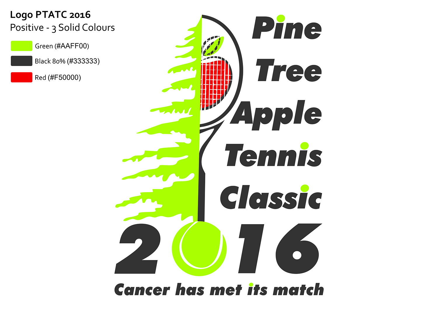
Pine Tree Apple Tennis Classic 2016
Want to win a job like this?
This customer received 45 logo designs from 21 designers. They chose this logo design from ibanex1976 as the winning design.
Join for free Find Design Jobs-
 US$160
-
 45 designs
-
 21 designers
Logo Design Brief
We are in need of a logo for the 2016 Pine Tree Apple Tennis Classic (PTATC). PTATC is one of the premier mixed doubles tournaments in the upper Midwest. Proceeds from this annual tournament benefit the cancer research program at Children’s Hospitals and Clinics of Minnesota. PTATC raises money to fund research that is saving lives all over the world. In 29 years we have raised over $4 million. We solicit a new logo for each year's tournament.
The logo must be suitable for letterhead, web site, and merchandise (t-shirts, ball caps), and event recognition is a key goal. Past logos have typically had 3-4 colors.
The specific requirements for logo content are as follows:
• a pine tree
• an apple
• a tennis reference (e.g. racquet, ball, etc.)
• the words “Cancer has met its match”
• the year—2016
Target Market(s)
Middle upper income benefactors and tennis playing community, adults 35-70, male and female
Logo Text
"Pine Tree Apple Tennis Classic 2016" (and) "Cancer has met its match"
Font styles to use
Other font styles liked:
- Designer choice, contemporary
Look and feel
Each slider illustrates characteristics of the customer's brand and the style your logo design should communicate.
Elegant
Bold
Playful
Serious
Traditional
Modern
Personable
Professional
Feminine
Masculine
Colorful
Conservative
Economical
Upmarket
Requirements
Must have
- The specific requirements for logo content are as follows:
- • a pine tree
- • an apple
- • a tennis reference (e.g. racquet, ball, etc.)
- • the words “Cancer has met its match”
- • the year—2016
Nice to have
- Bold colors that pop out on merchandise. A friendly yet professional feel is desired.
Should not have
- No characters, no cartoonish appearance. Some of the historical logos have had more of a "whimsical feel", we'd like this one to be slightly bolder and professional looking without being stark. It is a fun event to raise money for kids and the logo should help to capture that spirit.