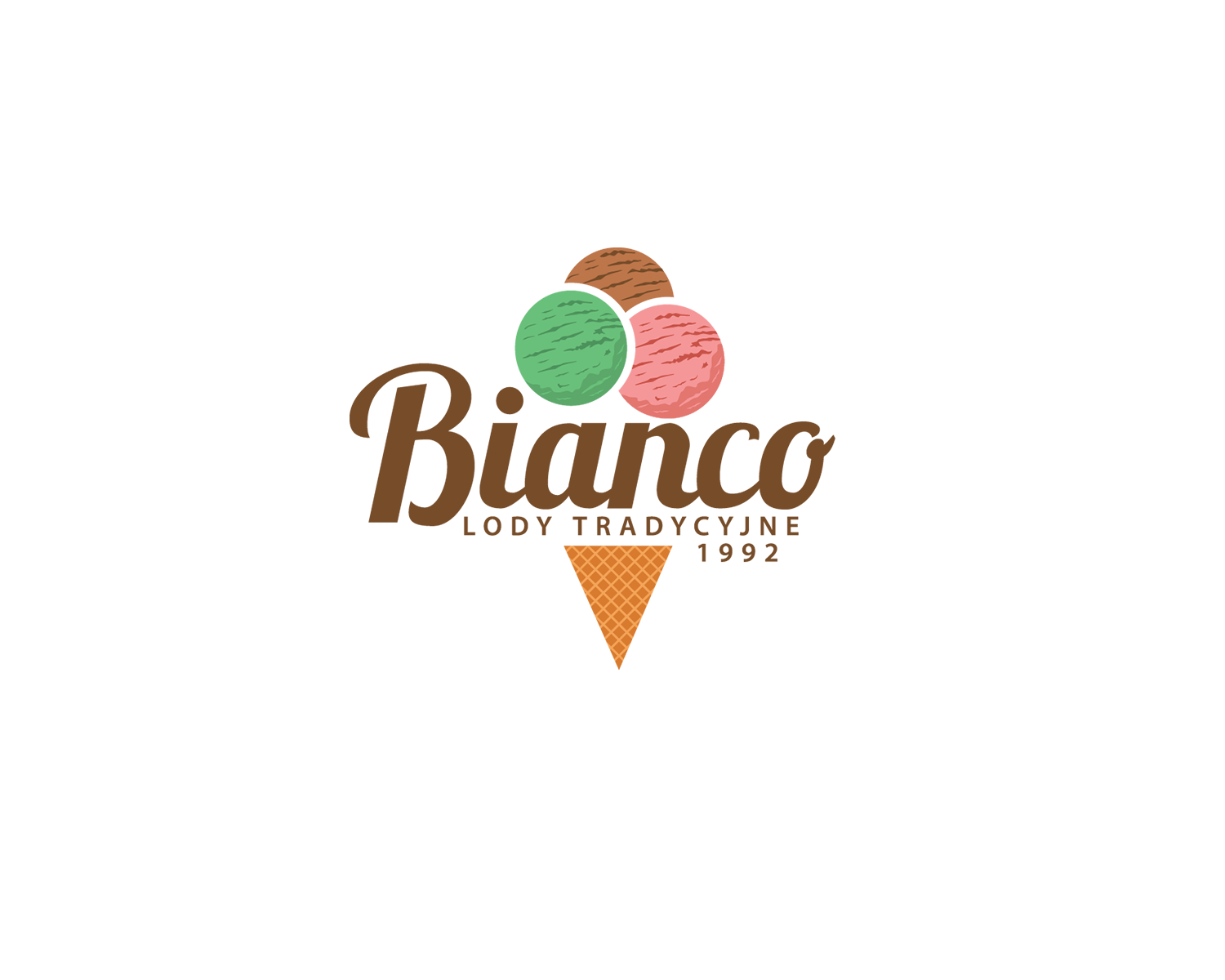
home made ice cream cafe Bianco eyecathcing, stylish and nice logo
Want to win a job like this?
This customer received 110 logo designs from 28 designers. They chose this logo design from Firstception as the winning design.
Join for free Find Design Jobs-
 €120
€120
-
 110 designs
-
 28 designers
Logo Design Brief
I would like to get some nice logo for our ice cream cafe. We are operating in Poland and our experience on the market is relatively long, the business started in 1992. From the beginning, we didn't have a good name, just lody tradycyjne which means ice creams (home made) that's all. Now we want to have a name maybe connected with the last one (lody tradycyjne) but just as a reminder to the people that Bianco is the same and we thought about putting the date on the logo (1992) to show that we have long experience (it is mostly about new customers which do not know us). What do we do? We are doing ice creams, they are home made and healthy we based our product on the natural ingredients (milk, eggs, sugar, fruits etc.) The product we do is very good at least people say that. We want that logo to be helpful in an advertisement of our brand, which we want to establish in a promotional way since we've got reputation but not the recognisability. As for now we sell the ice creams in one place but we are thinking about expanding the brand. Our customers are mixed, based on our reputation and long experience there are many people who commes to us for ice creams. Kids, youth, adults, old people, middle-income people, wealthy people, a few of poor people, many people, we are creating the image of well establish cafe which in my point of view for customers seems to be good place, (mostly because of experience and the product). Hope that description is helpful. :)
Bianco - means from italian WHITE, why we have choosen that? Foremost because it sounds nice, also because it is white which can be connected with something clear and we thought that we also do "clear" ice creams, we don't use any chemical stuff, and also we thought it can draw client's attention.
Target Market(s)
Kids, youth, adults, old people, middle-income people, wealthy people, a few of poor people, in general many people. Families, couples, less of singles
Industry/Entity Type
Cafe
Logo Text
Bianco, Lody Tradycyjne, 1992
Logo styles of interest
Emblem Logo
Logo enclosed in a shape
Pictorial/Combination Logo
A real-world object (optional text)
Character Logo
Logo with illustration or character
Wordmark Logo
Word or name based logo (text only)
Lettermark Logo
Acronym or letter based logo (text only)
Font styles to use
Look and feel
Each slider illustrates characteristics of the customer's brand and the style your logo design should communicate.
Elegant
Bold
Playful
Serious
Traditional
Modern
Personable
Professional
Feminine
Masculine
Colorful
Conservative
Economical
Upmarket
Requirements
Must have
- the name Bianco and below and in smaller font lody tradycyjne (means - ice creams) the date of establishment 1992
Nice to have
- perhaps something related to the ice creams, some drawing or something