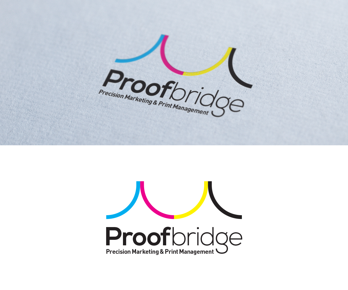
Proof Bridge - Logo Design
Want to win a job like this?
This customer received 81 logo designs from 33 designers. They chose this logo design from AGD as the winning design.
Join for free Find Design Jobs- Guaranteed
-
 US$300
-
 81 designs
-
 33 designers
Logo Design Brief
My company is re-branding and going with a new name in the process. We are currently Direct Print Solutions. You can get a feel for our current branding at www.directprintsolutions.com and www.directprintonline.com.
The new company name is Proofbridge. The new company tag line is "Precision Marketing & Print Management. To make the design transition from the old brand to new a bit easier, I'd like to keep the colors the same or perhaps build on the colors. The new company URL will be www.proofbridge.com.
Current Color CMYK Breakdowns:
Blue: C100, M35
Grey: 85K
Green: 45C, 0M, 100Y, 24K
Target Market(s)
Proofbridge - Precision Marketing & Print Management sells primarily business to business. We work with a lot of marketing professionals. Medium sized business are a perfect fit.
Industry/Entity Type
It Company
Logo Text
Proofbridge
Logo styles of interest
Pictorial/Combination Logo
A real-world object (optional text)
Abstract Logo
Conceptual / symbolic (optional text)
Look and feel
Each slider illustrates characteristics of the customer's brand and the style your logo design should communicate.
Elegant
Bold
Playful
Serious
Traditional
Modern
Personable
Professional
Feminine
Masculine
Colorful
Conservative
Economical
Upmarket
Requirements
Must have
- Art will have the following CMYK colors, BUT I will happily consider some deviation in the interest of artistic flare.
Blue: C100, M35
Grey: 85K
Green: 45C, 0M, 100Y, 24K
Technically I need 2 logos. I want one that can act as a stand alone and one that also includes the full company tag line "Precision Marketing & Print Management"
Project requires vector art. I run a printing company, so I will be picky. No jagged edges or lines please in the abstract or text componets. Native AI files are preferred.
Don't use any of the old logo for the new logo. It stinks.
Nice to have
- I'm very interested in a logo with some sort of alternate message. For example, Amazon has the little arrow that indicates from A to Z. In the FedEx logo you can see the arrow pointing to the right. Here's a link to other similar art.
http://blog.writeathome.com/index.php/2012/03/11-ingenious-corporate-logos/
As you consider this, keep in mind what we do. We help our clients increase employee productivity, dramatically increase revenue, and significantly cut costs.
Should not have
- Please do not break down the company name or logo into an acronym.