New innovative property management business needs a new logo
Want to win a job like this?
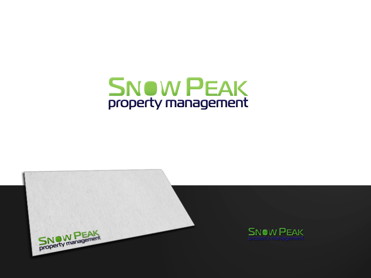
This customer received 50 logo designs from 26 designers. They chose this logo design from ArtSamurai as the winning design.
Join for free Find Design Jobs- Guaranteed
-
 A$200
A$200
-
 50 designs
-
 26 designers
Logo Design Brief
We need a new logo for a new property management company based in Brisbane, Australia called "Snow Peak Property Management". We are a proactive, energetic, innovative company and we are committed to adopt industry best practice to achieve the best result for our clients. The final design should reflect our philosophy, values, logo personality and install confidence to our target market and create a desire to engage (details as follows).
Our Philosophy: Highest standard of service, keeping client informed and never having to worry about their investment, professional, knowledge of relevant legislations, always have the best interest of clients in mind, win-win, our clients prosper and so do we.
Our Values: Ability, abundance, appreciation, attentiveness, caring, comfort, commitment, compassion, competency, confidence, consistency, dynamic, efficiency, effortless, energetic, enthusiasm, excellence, fairness, focus, growth, honest, integrity, knowledge, listening, loyalty, methodical, openness, optimal, passion, punctual, respect, security, service, strength, success, trust, uniqueness, wealth
Logo Personality: Female, Happy, bubbly, professional, energetic, open and honest, good sense of humour, she can do anything and give people a sense of confidence that the problem will get sorted, people love her and she loves people, she cares and is respectful and expects the same in return. Self-assured, outgoing, compassionate to people, listener, willing to ask the hard questions, calm, authority, adventurous.
Target Market: Middle to high incom investors with properties in inner city suburbs. Educated, knowledgeable, professionals (engineers, lawyers, business owners etc). Have an understanding of real estate and wants to prosper from their long term investment strategy. Stylish, trendy, busy and limited children. Career oriented, young at heart. Demand quality service and are prepared to pay for it. Love city living and uses what the city has to offer.
Industry/Entity Type
Property Management
Logo Text
(None provided)
Logo styles of interest
Wordmark Logo
Word or name based logo (text only)
Look and feel
Each slider illustrates characteristics of the customer's brand and the style your logo design should communicate.
Elegant
Bold
Playful
Serious
Traditional
Modern
Personable
Professional
Feminine
Masculine
Colorful
Conservative
Economical
Upmarket
Requirements
Must have
- SNOW PEAK (in capital case and larger with larger "S" and "P")
property management (in lower case and smaller)
The logo should focus on a bold font design and should:
Be strong and simple
Cut through the clutter
Convey a feeling of something refreshingly different
Focus on the strength of the name so the logo will cut through
Change the perception on what property management can really be
Make people feel they are getting something unique
Positioning Tag Line: Refreshing Proactive
Font: Strong, Bold, Modern, Youngish
Colour: Psm 369 – Green (dominant)
Psm 2765 – Dark Blue/Purple
(around these colours)
Mono: Must look good in black and white
Nice to have
- The logo should focus on a bold font design and should:
Be strong and simple
Cut through the clutter
Convey a feeling of something refreshingly different
Focus on the strength of the name so the logo will cut through
Change the perception on what property management can really be
Make people feel they are getting something unique
Should not have
- NO CLIQUES - NO SNOW AND NO PEAKS
NO old fashion font (eg. Times New Roman)