Website to launch new Wood2Energy app
Want to win a job like this?
This customer received 35 web designs from 4 designers. They chose this web design from SAC-D as the winning design.
Join for free Find Design Jobs-
 C$250
C$250
-
 35 designs
-
 4 designers
Web Design Brief
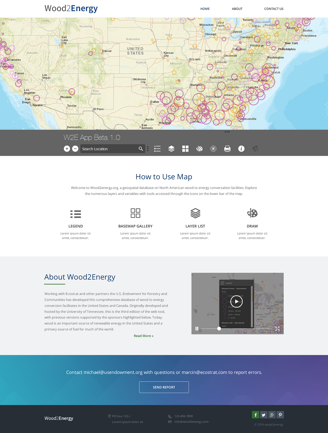
We need a redesign of a rather horrible looking wix sit: http://michael0603.wix.com/wood2energy.
The app on this site enables bioenergy companies to locate sources of wood fiber for to use as feedstock and other useful data never before assembled in one place.
The look needs to be simple, professional, modern / futuristic. Our preferred style / look / feel is the doc entitled "favorite style".
The basic tabs at the top should be Home, About and Contact Us.
Video tutorial and Report Errors should be somewhere else
The map should be front and center. Themap can be found here:
http://usforests.maps.arcgis.com/apps/webappviewer/index.html?id=a8ee2fe341bc419994ae39da9ae126cb
There are various base maps. It now defaults to the dark grey one. Don't use the this: too dark. Use the light grey or any of the others you like.
We like the large images and layouts in the attached "website sample"
Its a bit hard to learn how to use the map. I would like some icons at that help explain like: Legend, Basemap Gallery, Layer List. See the icons in "sample layout" for clarity.
Target Market(s)
professional
Number of Pages Required
4 page
Font styles to use
Look and feel
Each slider illustrates characteristics of the customer's brand and the style your logo design should communicate.
Elegant
Bold
Playful
Serious
Traditional
Modern
Personable
Professional
Feminine
Masculine
Colorful
Conservative
Economical
Upmarket
Requirements
Must have
- the wood2energy map front and center.