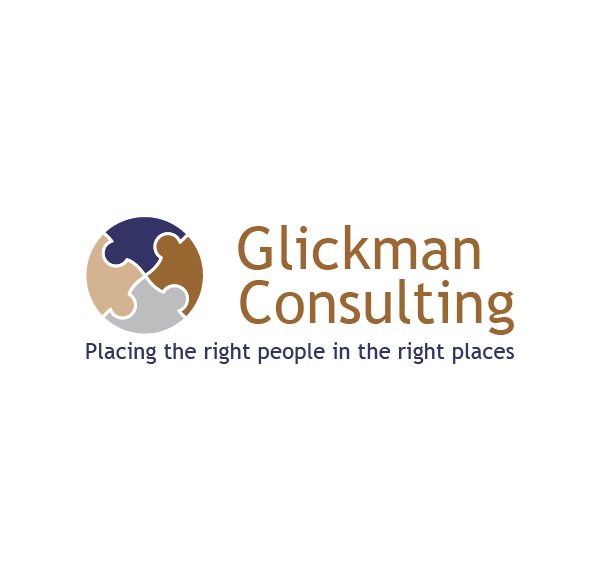
Glickman Consulting Logo Update
Want to win a job like this?
This customer received 52 logo designs from 16 designers. They chose this logo design from MJDesign as the winning design.
Join for free Find Design Jobs-
 US$160
-
 52 designs
-
 16 designers
Logo Design Brief
We want the updated logo to look similar, but updated and more sophisticated. Please use only the current colors of the logo – other colors will not be considered. This logo will go on this website: http://glickman-consulting.com/, so the new logo must be the same colors.
Your focus should be on re-working the puzzle pieces. The logo 'bug" is mostly the problem - it looks amateur. The current pieces are sharp, awkward and too fat/thin in different places. We would like to see the puzzle pieces as part of a world globe, and more graceful. We want a more professional and sophisticated look.
Our problem is not with the fonts. They can remain the same. The tagline “Placing the right people in the right places” must be readable – please use lower case letters for that.
People recognize the current logo so we want it to be similar – not a new concept, please, and definitely no new colors.
We have attached a circular logo bug from a previous contest that we accepted. However, we could not use it because it was re-worked stock vector art. Please submit only original work! Thank you.
Target Market(s)
Employees wanting to hire
Candidates wanting a job
Other recruiters needing help to fill jobs or get candidates jobs
Industry/Entity Type
Information Technology
Logo Text
Glickman Consulting Placing the right people in the right places
Logo styles of interest
Pictorial/Combination Logo
A real-world object (optional text)
Font styles to use
Look and feel
Each slider illustrates characteristics of the customer's brand and the style your logo design should communicate.
Elegant
Bold
Playful
Serious
Traditional
Modern
Personable
Professional
Feminine
Masculine
Colorful
Conservative
Economical
Upmarket
Requirements
Must have
- 1. Colors must be the same as current logo - NO EXCEPTIONS! - see pdf file
- 2. Please place on white background - not on buildings, on a slant, on our website, or on stationery. 3. Must fit nicely on the website www.glickman-consulting.com
- 3. Tagline in san serif,only capitalize first letter of tagline
Nice to have
- Clean design
Should not have
- Don't put on buildings, website screenshot, on stationery, etc.
- Do not use "puzzle pieces" that are on our current logo - must redesign those pieces