Australian investment property business for women needs logo design and guide for fonts and colours
Want to win a job like this?
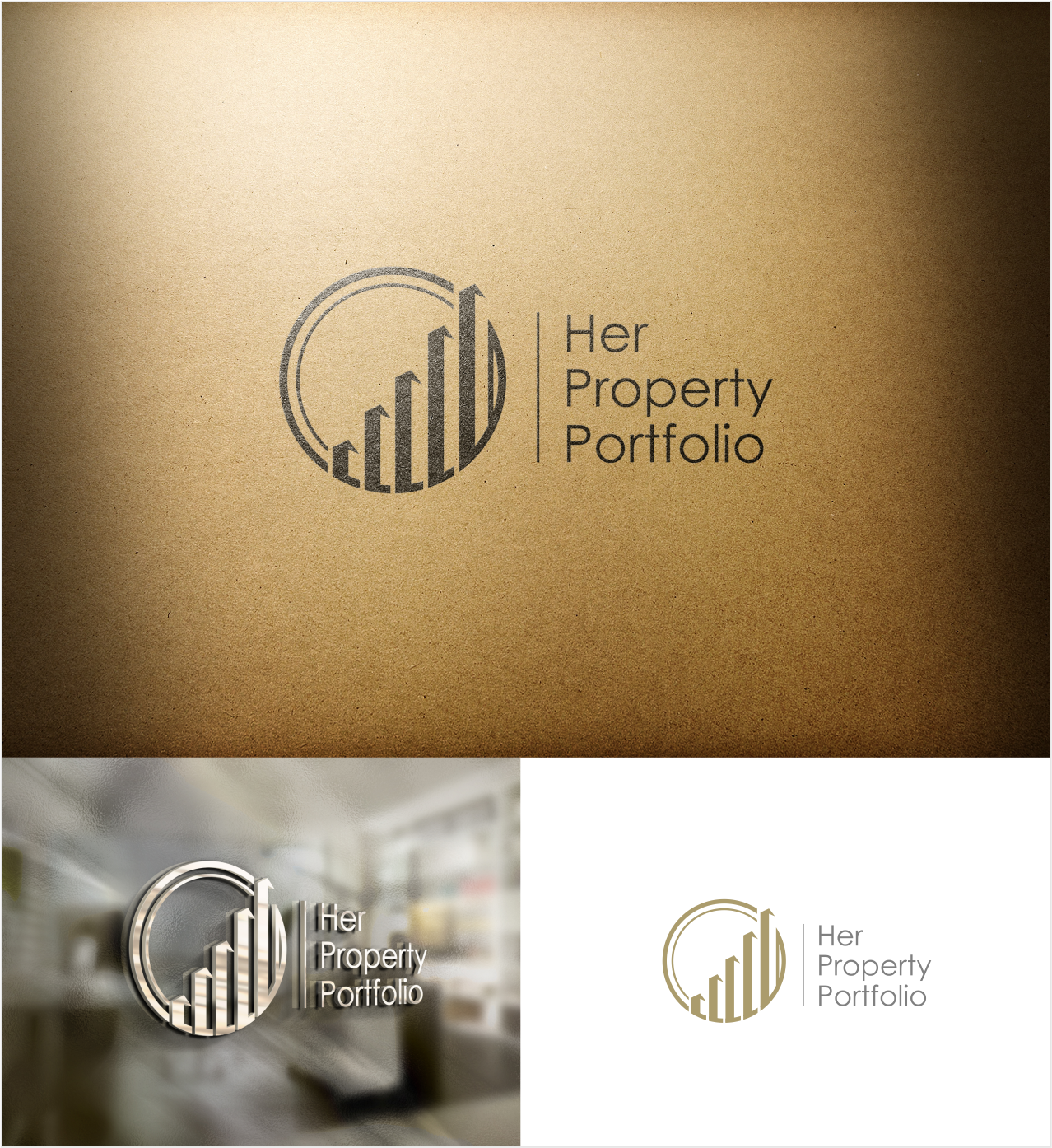
This customer received 81 logo designs from 20 designers. They chose this logo design from artswolf as the winning design.
Join for free Find Design Jobs-
 A$160
A$160
-
 81 designs
-
 20 designers
Logo Design Brief
We need a logo design for a company called "Her Property Portfolio" (HPP) based in Sydney. HPP aim to expand to all of Australia. We would also like a style guide (e.g., font and colours) for all external communication platforms (to work seamlessly across print and digital media). HPP help Australian women secure their financial futures through strategic investments in property.
We would like the design to convey feelings of confidence and trust, being informed, that we make it easy for our clients, financial growth and a better life for our clients.
HPP do not have any specific colours in mind, however we are looking for a design that is contemporary, but will not age too quickly.
The final design and style guide should convey confidence, success and financial growth for women.
Target Market(s)
Women aged 25 to 45 years old.
Industry/Entity Type
Investment
Logo Text
Her Property Portfolio
Logo styles of interest
Emblem Logo
Logo enclosed in a shape
Pictorial/Combination Logo
A real-world object (optional text)
Abstract Logo
Conceptual / symbolic (optional text)
Font styles to use
Look and feel
Each slider illustrates characteristics of the customer's brand and the style your logo design should communicate.
Elegant
Bold
Playful
Serious
Traditional
Modern
Personable
Professional
Feminine
Masculine
Colorful
Conservative
Economical
Upmarket
Requirements
Must have
- My project must be targeted towards women aged 25 to 45 years old.
- Eye catching colours that work for both print and digital media.
Nice to have
- if possible, the design could evoke a better lifestyle, success, getting ahead.
- Some abstract design/image would be great
Should not have
- My project must not have dollar signs ($) or images of money.
- Please try to avoid using just the letters HPP in the standard corporate blue shades with grey/black.