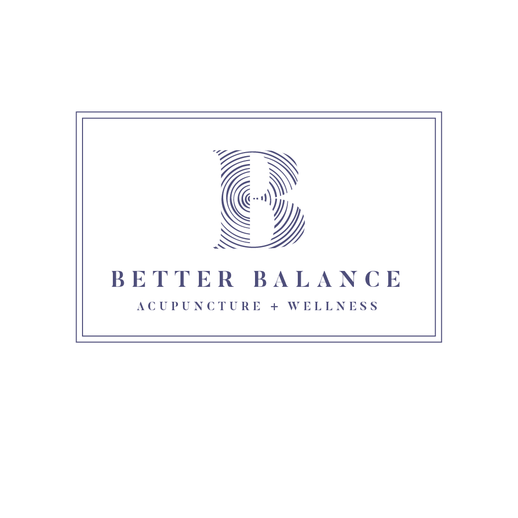
Logo design for Better Balance Acupuncture + Wellness
Want to win a job like this?
This customer received 59 logo designs from 18 designers. They chose this logo design from Irina Makedonska as the winning design.
Join for free Find Design Jobs-
 US$160
-
 59 designs
-
 18 designers
Logo Design Brief
I need a logo design for my new practice - "Better Balance Acupuncture + Wellness"
Better Balance
Acupuncture + Wellness
I chose this name Better Balance because I think that balance is something that everyone has sought to achieve at some point in their life. Some might even say that their life is in constant pursuit of achieving a better balance. Whether you’re discussing health, happiness, family life, career life, or any other aspect of our time here on this planet - I believe that balance is key.
When discussing design for a logo for my acupuncture practice, I really want to find a balance between being perceived as too woo-woo, hippie, out there and too medical, stale, boring, or even corporate or canned. I would like a design with depth, that is calming but also gives prospective patients a sense that this center for acupuncture is a credible, scientific-based and professional medical center.
I want the design to give a sense of the depth of this medicine: the calming, tranquil, centered and grounding effect that a treatment can have, without too much association of a spa-like atmosphere.
I am unsure of what I want for a logo and very open to ideas. I like the idea of perhaps something symmetrical to represent balance. I’ve played with the idea of using a moon - crescent or full (I know this is not symmetrical..) … But I wonder if that’s a little too out there… I think lotuses and yin yang symbols are a bit overused in my profession but perhaps the right variation could work… Maybe a moon and yin yang symbol combined?
I’ve attached a design I like from a schoolmate’s website. But am totally open to other ideas.
I am so excited to see what all you amazing designers come up with for me! This is a very exciting first step in my business and I can’t wait to see who will be a part of it! Happy designing! :)
Target Market(s)
My target demographic are women - but also men - aged 45-65 but I also would eventually like to venture into fertility and women’s issues - so women aged 30-45 as well…
Industry/Entity Type
Wellness
Logo Text
Better Balance Acupuncture + Wellness
Logo styles of interest
Pictorial/Combination Logo
A real-world object (optional text)
Wordmark Logo
Word or name based logo (text only)
Font styles to use
Colors
Colors selected by the customer to be used in the logo design:
Look and feel
Each slider illustrates characteristics of the customer's brand and the style your logo design should communicate.
Elegant
Bold
Playful
Serious
Traditional
Modern
Personable
Professional
Feminine
Masculine
Colorful
Conservative
Economical
Upmarket
Requirements
Must have
- The design must work in a rectangle AND square - for social media posts, etc.
Nice to have
- I think perhaps a grayish navy may be a great start perhaps combined with gold-bronze. I’ve also played with the idea of using gold-bronze paired with a teal-ish color (see attached logo and succulent for colors I mean)… I would also like to option for the design to look great in black or white on its own.
Should not have
- The colors red, orange or yellow.