logo design for new brand kids sunglasses (FatOncles)
Want to win a job like this?
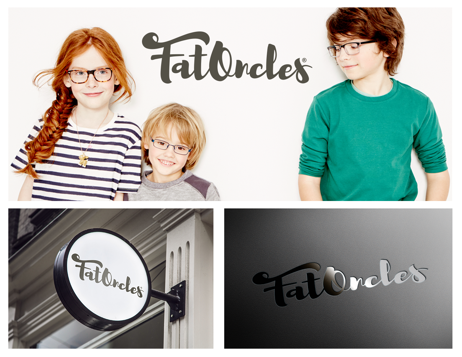
This customer received 89 logo designs from 37 designers. They chose this logo design from Frontino graphic studio as the winning design.
Join for free Find Design Jobs- Guaranteed
-
 €110
€110
-
 89 designs
-
 37 designers
Logo Design Brief
Logo design for Dutch startup (based Amsterdam, The Netherlands) in kids sunglasses that will be sold online.
Kids sunglasses usually are cheap looking, brightly coloured with screaming prints, from poor quality. Ours will be contemporary basics, in neutral colouring and design. Plus ours will be qualitative better than most, for a fair (not designerbrand) price.
Idea comes form two dads (good friends) that are surprised by the lack of good/basic/nice sunglasses for their kids. The dads are referred to as uncle by the kids. The one dad calls the other fat (as practical joke).
That is why the brand is called Fat Oncles. (pronounced as Fat Uncles).
With a hint to the monocle (glasses) in the way oncles is spelled.
Target Market(s)
Parents with eye for style/design, liking a (bold) brand that dares to do things differently and are used to shop online.
Industry/Entity Type
Online
Logo Text
FatOncles
Logo styles of interest
Emblem Logo
Logo enclosed in a shape
Pictorial/Combination Logo
A real-world object (optional text)
Character Logo
Logo with illustration or character
Wordmark Logo
Word or name based logo (text only)
Font styles to use
Look and feel
Each slider illustrates characteristics of the customer's brand and the style your logo design should communicate.
Elegant
Bold
Playful
Serious
Traditional
Modern
Personable
Professional
Feminine
Masculine
Colorful
Conservative
Economical
Upmarket
Requirements
Must have
- We need a logo for the brand itself, that also can be used (as part of the logo) on the frame of the glasses.
Nice to have
- Logo can be bold, not too classy.
- Must look contemporary/modern
- easy to use for small prints
Should not have
- too many bright colours
- kids appeal