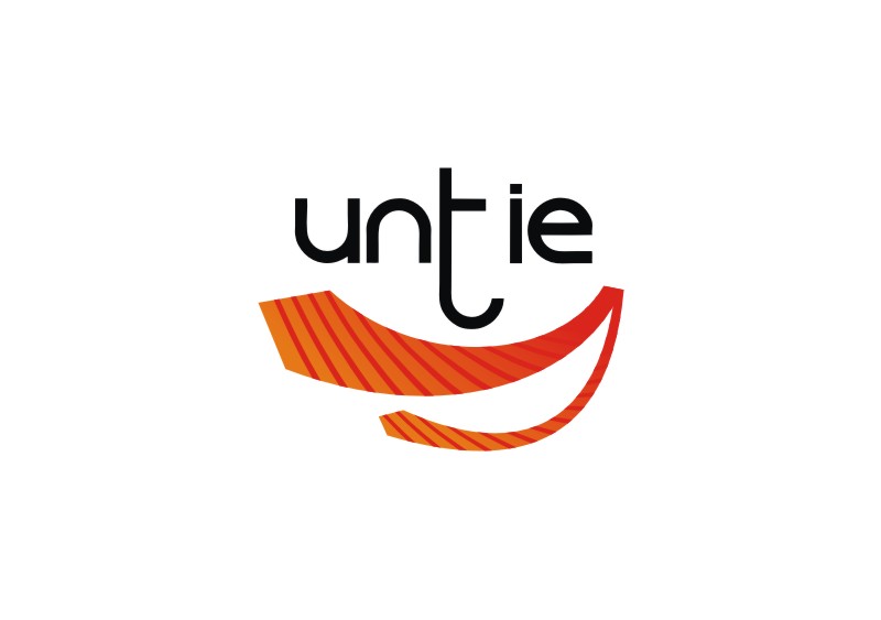
UnTie - Logo for Men's Lifestyle Site
Want to win a job like this?
This customer received 144 logo designs from 68 designers. They chose this logo design from Marcos! as the winning design.
Join for free Find Design Jobs- Guaranteed
-
 A$200
A$200
-
 144 designs
-
 68 designers
Logo Design Brief
A logo is needed for a lifestyle web site to be launched in Australia, aimed towards professional men between 18 and 40.
The brand is "UnTie" and will focus on ways in which working men can improve their lives with a range of helpful articles and information. It is about achieving the ideal balance between work and pleasure.
Some examples of what may be included on the site:
- Suiting up for the office
- Top 10 ways to relieve stress
- How to better manage your time
- Maintaining fitness while in a desk job
- Matching shirts and ties
The logo should have a bold, modern and fashionable look which clearly articulates the focus on the professional man.
As the name suggests, the "UnTie" logo should also convey a sense of loosening up or letting go.
While we are open to ideas and concepts, we believe a striped tie would be an effective element to include.
Variations of uppercase lettering are acceptable. For example: Untie, UnTie, unTie... etc.
Updates
Hi all,
Added Monday, December 26, 2011
Project Deadline Extended
Reason: Due to the Christmas/New Year period and some late entries, I've extended the deadline a few more days.
Adam
Added Thursday, December 29, 2011
Target Market(s)
Professional males 18 to 40 years old
Industry/Entity Type
Fitness
Logo Text
UnTie
Logo styles of interest
Pictorial/Combination Logo
A real-world object (optional text)
Abstract Logo
Conceptual / symbolic (optional text)
Character Logo
Logo with illustration or character
Wordmark Logo
Word or name based logo (text only)
Lettermark Logo
Acronym or letter based logo (text only)
Look and feel
Each slider illustrates characteristics of the customer's brand and the style your logo design should communicate.
Elegant
Bold
Playful
Serious
Traditional
Modern
Personable
Professional
Feminine
Masculine
Colorful
Conservative
Economical
Upmarket
Requirements
Must have
- A colored, striped tie.