Commercial General Contractor needs an updated logo.
Want to win a job like this?
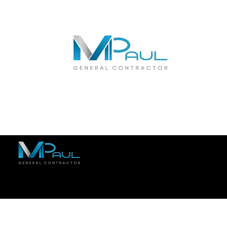
This customer received 199 logo designs from 75 designers. They chose this logo design from x logo as the winning design.
Join for free Find Design Jobs- Guaranteed
-
 US$440
-
 199 designs
-
 75 designers
Logo Design Brief
We need an updated logo for a commercial general contractor based in Central Florida. Company name is: M PAUL General Contractors. Current logo is an 'm' in a circle and below it the words 'M PAUL' underlined with the words 'general contractor' much smaller and under the words M PAUL. The 'm' and M PAUL is a darker blue and the 'general contractor' is a light silver grey. The problem with this logo is that it looks outdated. The m in the circle looks just like an 'm & m' candy. There are three fonts (the 'm', M PAUL, and general contractors are all different fonts. And the fonts are outdated. The company builds only commercial (ground-up buildings, medical offices, specialty, restaurant, etc...) - NO residential. We would like to keep the circle but updated and modern. The colors need to stick with a blue (on the darker side of blue) and the silvery grey (and/or white). I imagine the font and the colors will provide the solid construction feeling and maybe the circle will represent the team of people behind the company - the integrity, values and company culture (the circle can add not only a design element but a bit of a softer balance to the logo). We like simplicity. We would also be open to the idea of an open circle (maybe a bit more 'wave'like') and the M PAUL coming out of the circle rather than the current logo which essentially puts two m's side-by-side ('m' M PAUL).
Updates
Thank you to everyone who is submitting! After looking at the submissions we have decided that we do NOT have to keep the circle. We now see that we are looking for a great 'M' or a great 'M PAUL'. And the color does not have to be dark blue (although a blue is probably preferred). Please just be creative. Simple is better. Thank you!!
Added Monday, October 14, 2013
Project Deadline Extended
Reason: I am extending the deadline because we realized that the parameters we put on the design were too strict. Please just be creative. The only mandate is that is must say 'M PAUL' and 'General Contractors'. We are also going to upgrade to a committed payment vs a refundable status and I want the extra time for more submissions. Thank you!!
Added Monday, October 14, 2013
Project Deadline Extended
Reason: Still looking for the right design.
Added Monday, December 09, 2013
Target Market(s)
Our clients are individuals or companies looking for a builder for projects ranging from $100k to $7 million. Strictly commercial building - NO residential.
Industry/Entity Type
Contractor
Logo Text
M PAUL general contractors (OR) M PAUL General Contractors (OR) M PAUL GENERAL CONTRACTORS
Look and feel
Each slider illustrates characteristics of the customer's brand and the style your logo design should communicate.
Elegant
Bold
Playful
Serious
Traditional
Modern
Personable
Professional
Feminine
Masculine
Colorful
Conservative
Economical
Upmarket
Requirements
Must have
- Some shade of blue (darker preferred) - looking for a rich,deep, beautiful blue. We would like the new logo to have the circle on the left and next to the 'M PAUL' - not stacked like it is now.
Nice to have
- Currently we like the silvery gray touch with the blue.