Automated Convenience Store Logo
Want to win a job like this?
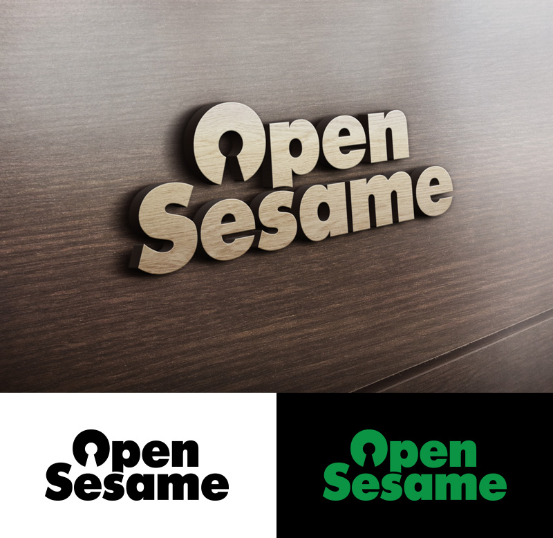
This customer received 187 logo designs from 57 designers. They chose this logo design from GARREY as the winning design.
Join for free Find Design Jobs-
 S$150
S$150
-
 187 designs
-
 57 designers
Logo Design Brief
This logo is for a new kind of convenience store. No cashiers, no checkout, just grab and go! It's called 'Open Sesame' and we are looking for a design that is typography based where the words Open is stacked above Sesame. It should be bold, fun and credible. It must look good as a signage on the store front.
This is what the store could be like, take a peek: https://www.youtube.com/watch?v=NrmMk1Myrxc
Target Market(s)
This store will be opened at a university so the target audience are undergrads/master students.
Having said that, the next store could be in the business district. So the target audience is psychographically-defined: Savvy consumers who are open-minded and excited by new experiences.
Industry/Entity Type
Convenience Store
Logo Text
Open Sesame
Logo styles of interest
Wordmark Logo
Word or name based logo (text only)
Font styles to use
Look and feel
Each slider illustrates characteristics of the customer's brand and the style your logo design should communicate.
Elegant
Bold
Playful
Serious
Traditional
Modern
Personable
Professional
Feminine
Masculine
Colorful
Conservative
Economical
Upmarket
Requirements
Must have
- - Bold welcoming look that is eye-catching as a signage measuring 1.2m in length
- - The words 'Open Sesame'
- - Easy to translate the look into posters and other designs later
Nice to have
- A couple of thought-starters:
- - Could the logo be reminiscent of a Japanese convenience store? See reference.
- - Could a symbol like keyholes, doorways or 'OPEN' signs be incorporated subtly into this typographic logo?
- - Preference for signage consisting of individually cut out 3D letters
Should not have
- Too many finicky details