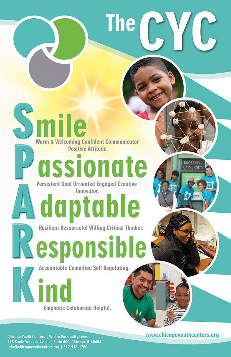
Chicago Youth Centers SPARK Poster

Want to win a job like this?
This customer received 50 poster designs from 20 designers. They chose this poster design from NILDesigns as the winning design.
Join for free Find Design JobsPoster Design Brief
We need a poster to put up around our Community/Youth Centers that shows the acronym S.P.A.R.K. which stands for the traits our that make up the culture and personalities of our youth, families and staff. We would like the color scheme to be in our brand colors, and will send them as an upload (grey, blue, green). The poster must have our logo & tagline (uploaded), which may be small and not central. It should have the acronym with the associated words spelled out - as the smaller descriptive words as shown in uploaded attachment. It should be fun - youth friendly (ages 3-18) and really pop. I have also uploaded a sample poster that we created - but don't like....it feels boring, uninspired. It must say "The CYC" S.P.A.R.K as SPARK is also the name of a different youth agency and we don't want our acronym to be confused with their name. Finally - to tell you a bit more about our organization I have uploaded our annual report. We can't way to see your ideas!!
Target Market(s)
Internal Information Poster for our community centers
Industry/Entity Type
Education
Font styles to use
Other font styles liked:
- FUN
Look and feel
Each slider illustrates characteristics of the customer's brand and the style your logo design should communicate.
Elegant
Bold
Playful
Serious
Traditional
Modern
Personable
Professional
Feminine
Masculine
Colorful
Conservative
Economical
Upmarket
Requirements
Must have
- It must say "The CYC" S.P.A.R.K as SPARK is also the name of a different youth agency and we don't want our acronym to be confused with their name
- The CYC S.P.A.R.K. - and associated words - should be dominant/prevalent ....
Nice to have
- Fun Images/photos of actual sparks....
Should not have
- As described w/uploads