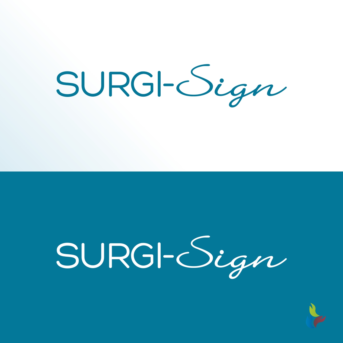
Logo for new product for the hospital

Want to win a job like this?
This customer received 180 logo designs from 52 designers. They chose this logo design from Kreative Fingers as the winning design.
Join for free Find Design Jobs- Guaranteed
Logo Design Brief
An appropriate logo for a medical device company with one product, a temporary tattoo that is used before an operation. The surgeon puts the tattoo on the patient and signs it. Then the patient, nurse, and anesthesiologist sign it so everyone agrees this is "the spot" where we are going to operate.
The site will be http://surgisign.com and, depending on when you check, it may have a homepage similar to the image I uploaded. If it looks different, it is before we did any real design.
I included a file called "First attempt at page 2" to show you we first considered using the obnoxious yellow and blue colors of the tattoo for the website. We changed our mind because those colors just made the site look cheap and poorly designed.
We would want a logo works against white backgrounds as well as the site we are designing. We would want the background to be transparent and, if you're selected, perhaps you'll give us suggested guidelines about how to treat the logo when we send it out to publications (not stretched, etc.).
Target Market(s)
hospital surgeons, hospital C-suite
Industry/Entity Type
Hospital
Logo Text
Surgi-Sign
Logo styles of interest
Wordmark Logo
Word or name based logo (text only)
Lettermark Logo
Acronym or letter based logo (text only)
Font styles to use
Look and feel
Each slider illustrates characteristics of the customer's brand and the style your logo design should communicate.
Elegant
Bold
Playful
Serious
Traditional
Modern
Personable
Professional
Feminine
Masculine
Colorful
Conservative
Economical
Upmarket
Requirements
Must have
- the name with hyphen: Surgi-Sign
Should not have
- Here are the colors to avoid and why:
- Black = death/dead,
- Green = infection/badness,
- Red = blood, bleeding,
- Brown = "messy..."
- As you can see, we include blue in our new homepage design but my client, an anesthesiologist, told me to avoid "some shades of very light blue that might say cyanosis (not enough oxygen). But he did approve the website use of blue.