Logo Design Project
Want to win a job like this?
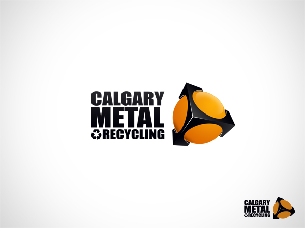
This customer received 25 logo designs from 12 designers. They chose this logo design from Omega as the winning design.
Join for free Find Design Jobs- Guaranteed
-
 US$200
-
 25 designs
-
 12 designers
Logo Design Brief
We are a metal recycling company. We take in all types of industrial metals: steel, copper, aluminum, etc. The recycling industry websites you will find always show pictures of dirty metal. Although it's a dirty business we are actually helping to clean up the environment. We want people to see metal recycling as a clean business. Not something that involves heavy machinery, dirt, old metal etc. although that is part of the process, the end result for example is:
- recycled scrap in place of virgin iron ore can yield 90% savings in raw materials used, 40% reduction in H20 use.
- used recycled scrap in place of virgin iron ore can yield 75% energy savings, 86% reduction in air polution.
So with the logo we want to use our entire name"Calgary Metal Recycling". In the past we have only used Calgary Metal but the general public doesn't know what that means. Once you put the word recycling, people are more apt to understand what our business is. We are the largest recycling facility in our city... helping the planet and running an environmentally responsible business that you can trust.
Design has to have black and orange as our bins that we send for customers to put their metals in are a bright orange and it can't be change. The pantone for the orange is 021. Our website is being redone so looking at the website will not help much as we are giving our company a whole new fresh face.
We want something clear, clean and fresh. We are open to a symbol with the words Calgary Metal Recycle.
colors MUST stay black and orange as per the pantone color mention above and 100 black. We are trying to avoid the logo looking like metal per say. No other colors other than orange and black indicated above can be used. The company wants to avoid any taglines. Looking for something very professional.
Updates
Hi everyone:
i just want to make sure everyone understands the design has to have black and orange. The pantone for the orange is 021 and black has to be 100%. Our website is being redone so looking at the website will not help much as we are giving our company a whole new fresh face.
We want something clear, clean and fresh. We are open to a symbol with the words Calgary Metal Recycle.
We are trying to avoid the logo looking like metal per say. No other colors other than orange and black indicated above can be used. The company wants to avoid any taglines. Looking for something very professional.
Added Friday, January 27, 2012
I just want to thank everyone who submitted their designs. I use to be a designer in my first career and I know the creativity it takes to be coming up with innovative ideas. There was lots of great submissions. Keep up the great work!
Added Thursday, February 02, 2012
Industry/Entity Type
Industrial
Logo Text
Calgary Metal Recycling
Look and feel
Each slider illustrates characteristics of the customer's brand and the style your logo design should communicate.