180 year old family run packaging business needs to modernise their logo
Add your question or comments below
Some good attempts so far. To be clear the owl (if being featured) must be the same as before. If colours are being used it must be red or a neutral black/grey. Blues and greens etc do not work for us.
We are not necessarily looking for drastic changes but just to modernise.
Having had a number of designs through now we have made the following decisions:
1. The original owl image must feature. If it is going to be a separate colour from black or grey then it must be red.
2. The owl needs to feature at the same level as the wording rather than above it. The reason being is that on letterheads it will take up too much space. We would prefer more of a rectangle logo rather than a square shaped one.
3. Please include somewhere that we were established in 1837.
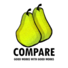
Thank you for considering Compare, to design your logo concept. Any feedback is much appreciated. The note about preference in shape can be revised on this end.
COMPARE: Good Works with Good Works
Thanks for the extension that more ideas would filter through.
Question: Would a change to the layout of the letterhead be an option? Just a proposal. Also, being that the rectangular shape can still have more height than preferred, are the dimensions of the current logo preferred (if an alteration to the letterhead is out of the question)? Thanks in advance for the feedback
COMPARE: Good Works with Good Works
lol
-
 Previous page
- You're on page 1
- Page 1 of 1
-
 Next page
1 - 6 of 6 comments