Bottle Labels for Beer (Cherry Beer)
Want to win a job like this?
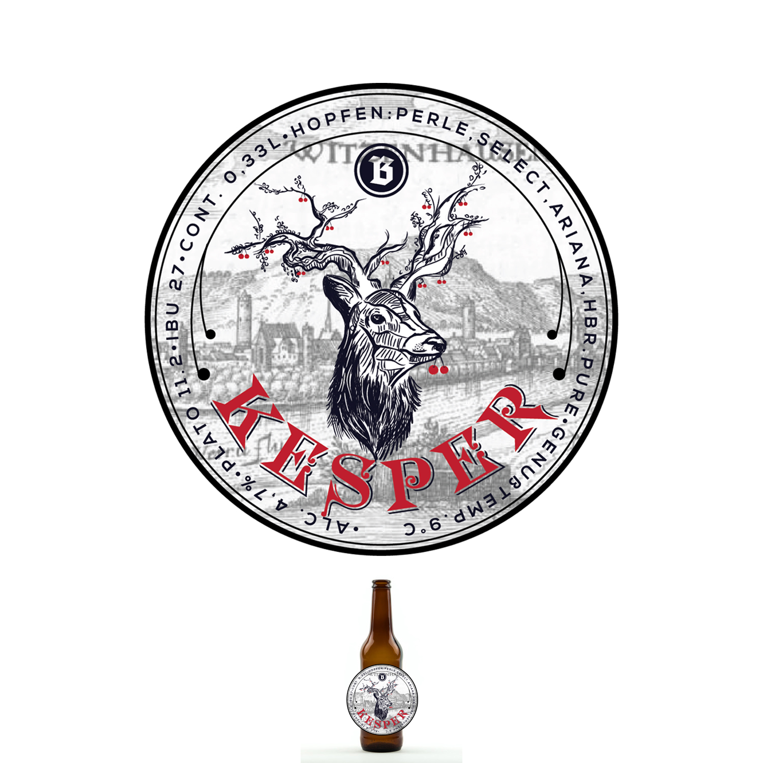
This customer received 33 label designs from 7 designers. They chose this label design from deadPixel as the winning design.
Join for free Find Design Jobs- Guaranteed
-
 €90
€90
-
 33 designs
-
 7 designers
Label Design Brief
The goal is to design an interesting labeling for a 0,33l bottle for a German beer. The bottle has three labels in total: front, back and "neckholder". The product that is relevant in the first shot is a cherry beer. Only this one is asked to design right now. The further labels will be designed later on as carry-on projects on DesignCrowd with the chosen design as framework.
Nevertheless the label now will affect the other labels later on for the beers. The label should contain a part that connects all beers to each other. This may be e.g. a part of the canvas that is stable across all front side labels, a character that repeats across all labels or something that connects in any other way the labels later on together. There should not just be simple systematic of a label that changes the colour to distinguish between the different kinds of beer later as the CI color palette limits this. Some beers have one label and then do it in red, green, brown, blue etc. to distinguish between the kinds. It is ok to reference to the beer's colour and a blue, white, black or, wood or paper colour change may be helpful to distinguish. The range of beers that will be introduced are at least for cherry (right now), honey beer, pale ale, IPA, amber, dark, pilsener.
FRONT LABEL
The label should contain the full logo or just the "B". If inconvenient, the label can come also without the logo or "B" when reflected strongly in the upper "neckholder label".
NECKHOLDER LABEL
The neckholder label is a front-side label at the bottleneck. I'm fine if this shows just the logo and nothing else. If you got great other ideas, just go for it.
BACKSIDE LABEL
The appearance on the backside label should enable a co-branding as some beers are done in co-operation with others (in this particular case with the cherry producers and their AGU logo with the cherries). If you split the label in half or put the two logos ("B" and AGU") together as they are both round, is up to you. A positioning in front of the company name might also be an option.
The general Idea is that the backside label is constant across all products (except text and specifications) and just the part for the supporter/partner changes. The backside label has to include the standard objects like EAN barcode, ingredients, net filling content etc.
THE BRAND
The CI colours or themes should be followed where possible. Colours out of CI may be used e.g. the red to relate to the cherry or display of a cherry. Other exeption is the part on the backside where the logo of the partner is shown. Some preferences: round better than cubism, handcraft better than high tech, nature better than industry.
The max. size of the labels is fixed due to technical reasons. Nevertheless, parts of the label may be printed dark brown as the bottle's colour to offer e.g. the appearance of a round label.
The files that describe some hints as well as the text are
- readme-text
- readme-background
I hope, you git interested inn this project and the upcoming designs for the other beers afterwards. For questions, just let me know. Thanks in advance!
Florian
Target Market(s)
only local / regional customers for the cherry beer and tourists that visit one of the biggest cherry growing regions in Europe.
Look and feel
Each slider illustrates characteristics of the customer's brand and the style your logo design should communicate.
Elegant
Bold
Playful
Serious
Traditional
Modern
Personable
Professional
Feminine
Masculine
Colorful
Conservative
Economical
Upmarket
Requirements
Must have
- A reference to Rehbocks on at least one of the frontside labels. This can be the full logo with text roebucks and the "B" of just the "B" if a discrete reference might be a better fit.
Nice to have
- declaration table that provides deeper insight in the specifics of the product for "insiders" like bitter units, alcohol, hops used etc.
Should not have
- too many colours. For the pallet dark blue to white and black to white feel free; green is to avoide, red may be used in this specific case as an exception to underline that it is a cherry beer.