Redesign of wordmark logo
Want to win a job like this?
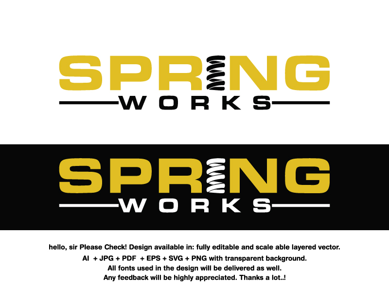
This customer received 241 logo designs from 81 designers. They chose this logo design from sweetdream 3 as the winning design.
Join for free Find Design Jobs- Guaranteed
-
 US$250
-
 241 designs
-
 81 designers
Logo Design Brief
We would like a simple, strong, and tech logo that uses just our name and a coil spring for the "I" in Spring Works or on the outside of the name before the "S" in Spring. We do not like the specific coil spring in the attachment file1 - picpic. We do like file4 through file8 coils. We would like creative ideas for coil springs that fit with the fonts supplied or a similar better font. The coil spring in front of the "s" in spring could work.
The fonts may be italicized or not. We like the sportcenter font most but the lowercase "g" and "s" don't have enough spacing between the ends of the letters. Also the all upper case sportscenter font "S" and "G" ends are too close to the body of the "S". The Eurostile all upper case is good but we like the sportscenter more if the above changes could be made. We do not like the Eurostile font lower case letters. The letters are too narrow where they connect (see p, r, n, and g). Gold and or black colors
Updates
Need extra days to review
Target Market(s)
35-55 male & female.
Industry/Entity Type
Auto Repair
Logo Text
Spring Works
Logo styles of interest
Abstract Logo
Conceptual / symbolic (optional text)
Wordmark Logo
Word or name based logo (text only)
Font styles to use
Other font styles liked:
- eurostile, sportscenter
Colors
Designer to choose colors to be used in the design.
Look and feel
Each slider illustrates characteristics of the customer's brand and the style your logo design should communicate.
Elegant
Bold
Playful
Serious
Traditional
Modern
Personable
Professional
Feminine
Masculine
Colorful
Conservative
Economical
Upmarket
Requirements
Must have
- Coil Spring. See description
Nice to have
- Coil may be simple / minimalist. The coil must be able to stand on it's own because it will in some media.