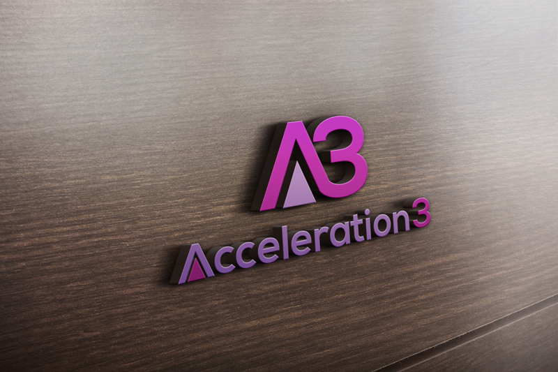
Acceleration Logo for online training platform for service entrepreneurs

Want to win a job like this?
This customer received 169 logo designs from 79 designers. They chose this logo design from soil as the winning design.
Join for free Find Design Jobs- Guaranteed
Logo Design Brief
PROJECT: Looking for a new logo for my online course platform. I help service professionals transform their unique know how into a profitable business. The name of my programme is Accélérer3 (yes. I'm French speaking) and the tagline translated directly from French is accelerate your independance.
DESIGN: I'd like the logo to take the letter "a" and combine it with the number 3.... (small or caps) but open to other ideas too.
COLOR: I like purples, pinks and greys, and happy with gradients, or solids.
FONT PAIRING: My website fonts are (Google) Comfortaa for Titles and Raleway for body.
FEELING: The design should communicate a sense of "going faster", while remaining playful and light.
Target Market(s)
service professionnals who are just starting out (either launching their business or have been at it for a few months and are struggling). Most of my clients are women between 30 - 45 years old.
Industry/Entity Type
Training
Logo Text
the logo "icon" should be the combination of a and 3 - text accélérer3
Logo styles of interest
Abstract Logo
Conceptual / symbolic (optional text)
Lettermark Logo
Acronym or letter based logo (text only)
Font styles to use
Other font styles liked:
- It has to pair nicely with (Google) Comfortaa and Raleway that I use on my website.
Colors
Colors selected by the customer to be used in the logo design:
Look and feel
Each slider illustrates characteristics of the customer's brand and the style your logo design should communicate.
Elegant
Bold
Playful
Serious
Traditional
Modern
Personable
Professional
Feminine
Masculine
Colorful
Conservative
Economical
Upmarket
Requirements
Must have
- logo icon combination of the letter a and the number 3
- ... or a stylized A with three "elements" showing the dynamic growth people go through when entering the programme
Should not have
- rockets, or too obvious "acceleration" symbols