real estate logo
Want to win a job like this?
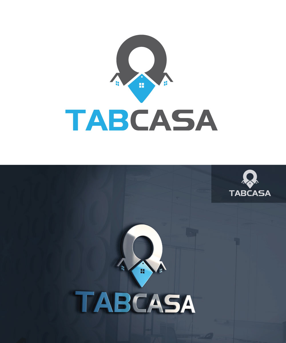
This customer received 134 logo designs from 70 designers. They chose this logo design from Trendzdesign as the winning design.
Join for free Find Design Jobs-
 US$150
-
 134 designs
-
 70 designers
Logo Design Brief
The name of the brand is “tabcasa”. “Tab” stands for tabulator and “casa“ means house in Spanish. It is a website for real estate sales. We thought that the name can look like a route or a path, so it would be written in a continuous line; the background would suggest or allude to a map and obviously, it should allow the name on the logo to stand out. It doesn’t have to be a rigid design, only allusive and fun. No childish fonts. And obviously, some element that suggests a house or houses. Our site is going to be white with blue tones (#004274, #00aeef). When you search in Google maps for car directions, the route appears in blue with darkers borders. Those are the colors to be used in the name. The brand name is a name composed by two concepts, but we want them to be joined in the same line. We don’t want logos with keys. Our website is going to be similar to Trulia, so that we are using the same technology as Google maps (take notes and explore ideas). Not boring. The logo should be delivered in the following formats: .ai .eps and .png. And the logo text “tabcasa” should be in lowercase.
Logo Text
tabcasa