Mira Properties (sustainable architecture developing company)
Want to win a job like this?
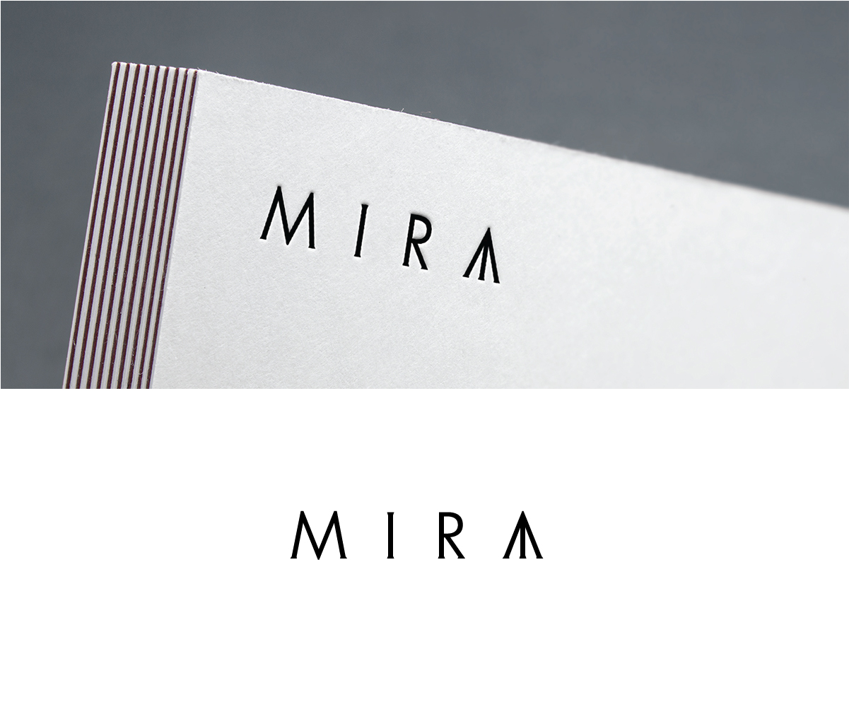
This customer received 305 logo designs from 133 designers. They chose this logo design from Alien Cookie as the winning design.
Join for free Find Design Jobs-
 £110
£110
-
 305 designs
-
 133 designers
Logo Design Brief
Mira is a high-end sustainable architecture developing company. Nature, space, architecture, and art. These 4 agreements combined gave birth to Mira. Organic-raw materials like wood, stone, glass make part of the architectural pillars of Mira Properties, having the landscape, nature as its main agent. Space in each of our properties is essential, the essence of emptiness is natural in order to create life and there write life stories, a home. "D’être entouré de ceux qu’on aime, cela suffit. »Which translates to be surrounded by those and what you love, and that’s enough. We are committed to inspiring others through authenticity, creative thinking, integration of sustainability and respect for nature.
Updates
Please, check on the new references. Thanks.
Added Friday, September 21, 2018
Target Market(s)
Architecture, art, real estate developing
Industry/Entity Type
Real Estate Development
Logo Text
MIRA
Logo styles of interest
Pictorial/Combination Logo
A real-world object (optional text)
Abstract Logo
Conceptual / symbolic (optional text)
Font styles to use
Other font styles liked:
- please look up reference.
Colors
Colors selected by the customer to be used in the logo design:
Look and feel
Each slider illustrates characteristics of the customer's brand and the style your logo design should communicate.
Elegant
Bold
Playful
Serious
Traditional
Modern
Personable
Professional
Feminine
Masculine
Colorful
Conservative
Economical
Upmarket
Requirements
Must have
- Simplicity but strong.
- Mira Properties is named after Mira Shendel, my favorite Brazilian artist - please google her up to so you can understand a bit of what her art transmits.
- The little orange triangle I draw, it's actually gold, so to please do the triangle in gold color.
Nice to have
- I like simple designs, nothing too complicated or full of things.
- Prefered colors: MIR in black and A (the triangle in gold)
Should not have
- Too many colors, or too complicated.