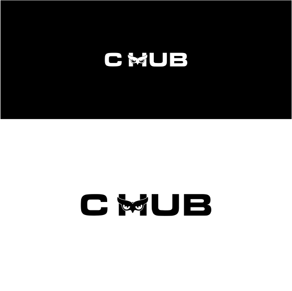
C HUB Cafe
Winner
Want to win a job like this?
This customer received 316 logo designs from 139 designers. They chose this logo design from magic art as the winning design.
Join for free Find Design Jobs-
 US$390
-
 316 designs
-
 139 designers
Logo Design Brief
specialty coffee shop C: comes from: Caffeine
The internal colors inside the coffee shop design will be white and light wood (see the picture)
The inspiration was derived from bird (OWL) why? the reason behind our choice is the (EYES) of the owl, the focus must be on the eyes as a sketch not a photo
Please: do not copy from the internet
Updates
Gathering more feedback
Target Market(s)
from 18 to 55 years old.
both male and female
Logo Text
C HUB
Look and feel
Each slider illustrates characteristics of the customer's brand and the style your logo design should communicate.
Elegant
Bold
Playful
Serious
Traditional
Modern
Personable
Professional
Feminine
Masculine
Colorful
Conservative
Economical
Upmarket
Requirements
Must have
- Brand Name: C HUB
- Logo Symbol: bird OWL that's highlighting the eyes
Nice to have
- Our Slogan: (Keep your eyes wide open)
Files
Download all files - 0.2 MBJPG
similar to this.jpg
Tuesday, October 23, 2018
JPG
owl-logo-set-vector-illustrations-450w-1070504051 Thursday, 25 October 2018 15:53:14
Thursday, October 25, 2018
Payments
1st place
US$260
Participation payments x 3
US$30
Participation payments x 4
US$10