BRANDING MOODBOARD - TEST PROJECT
Want to win a job like this?
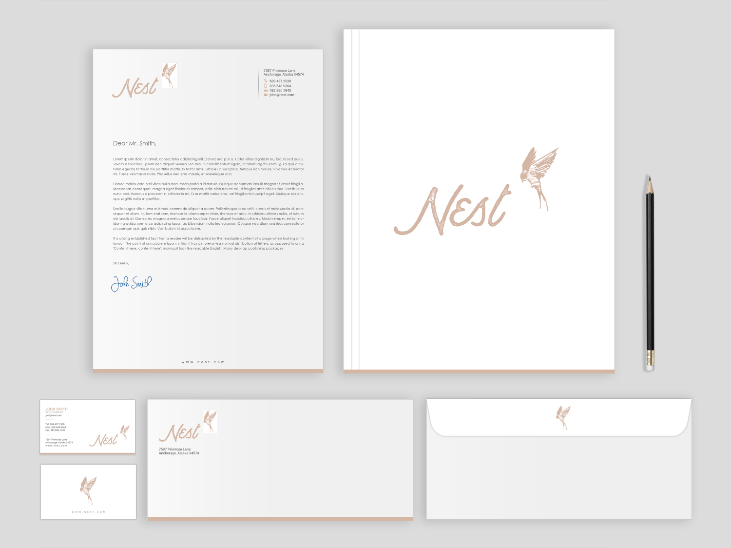
This customer received 29 stationery designs from 8 designers. They chose this stationery design from chandrayaan.creative as the winning design.
Join for free Find Design Jobs- Guaranteed
-
 US$150
-
 29 designs
-
 8 designers
Stationery Design Brief
Description in link:
https://www.dropbox.com/s/g90653se7c0yyqd/NEST%20Moodboard%20Project.pdf?dl=0
You'll notice that most of my images are a little dark / edgy or dramatic & gripping. An unplanned pregnancy elicits a lot of emotion including but not limited to fear, angst, uncertainty, shame, pressure, etc. My hope is that my materials will display a strong contrast between the dark (fears) and light (hope). The young women who will be part of this program will have a comprehensive support system that will help to strengthen, encourage and prepare her for the road ahead - whether she choses to go the route of becoming a single mother or whether she decides that placing the baby up for adoption is best. Either way, she will receive the utmost care, love, and compassion for her courage to see the pregnancy through to full-term.
Our motto is "Bring Life". Not only is this young woman "bringing life" into the world, but the Host Families and Mentors will also be "bringing life" to the young mother by giving her hope beyond this season.
Target Market(s)
Females ages 18-24 who are unwed and find themselves unexpectedly pregnant who lack the support they need.
Industry/Entity Type
Non Profit
Font styles to use
Other font styles liked:
- I've been using Anchorage for Nest - and I'm indifferent re: Montserrat
Colors
Colors selected by the customer to be used in the logo design:
Look and feel
Each slider illustrates characteristics of the customer's brand and the style your logo design should communicate.
Elegant
Bold
Playful
Serious
Traditional
Modern
Personable
Professional
Feminine
Masculine
Colorful
Conservative
Economical
Upmarket
Requirements
Must have
- This is just a moodboard project, however the winner will be awarded numerous projects to follow - each with their own budgets, creative briefs, etc. Future projects to include:
- - Logo clean-up. The current mechanical files are poor (combo .eps and .png) I want all-vector artwork for scalability.
- - Stationery System (letterhead, envelope, business card, thank you note, simple folder for presentation materials)
- - Basic Website (Likely Wix - est. 10 pages) limited functionality, no ecommerce, no special features.
- - PowerPoint (or similar program) Template
- - One-Sheets : single page presentation materials (copy-heavy docs).
- - Brochure
- - Pitch Book (likely Blurb, or Artifact Uprising or something similar)
- - Icon System.
- * If a bird is used it must be a swallow. The Bible verse Psalm 84.3 is an essential part of the company's name.
- * I particularly like hand-drawn elements as demonstrated by the current bird in the logo. They're very human and "not perfect".
- * Generally I'm a huge fan of simple and clean. Not crazy or over the top modern/contemporary though. I just love lots of white space and simple, organic / natural feeling materials. For that reason I've chosen what I think are fairly muted / earth-tones for the soft pinks.
- * I like monochromatic and muted color palettes. I'm open to suggestions if the designer would like to make alternate recommendations to the colors.
- * Finally, I'm not married to the logo. If someone has another version that they feel strongly about I'm completely open to considering. At one point I was playing with a "scribbled" nest in the logo as opposed to the bird. (attached in image files below)
Nice to have
- I particularly liked image "Nest-5". I sort of feel like this image says it all. The words in her tatoo are gripping and poignant. It's important that the entire tone of the brochure not be "dark, fearful or uncertain" -- but that we turn such an uncertain season as an unplanned pregnancy into something hopeful and full of light, optimism and peace.
- I'm not crazy about my current "complimentary" typefaces - especially Bebas Neue. I'd love to see some alternate type systems ... demonstrating how headlines and body copy would be treated in fonts that play nice with the logo.
- I'm also not married to Anchorage. I liked the kind of retro / vintage thing, but it's definitely not necessary.
Should not have
- Do not include any material or messaging pertaining to "pro-choice". This is a distinctly pro-life and pro-love initiative.