Dental office in Toronto Named T-Dot Dental
Want to win a job like this?
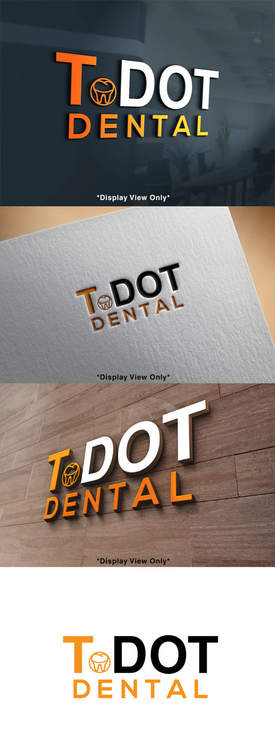
This customer received 128 logo designs from 61 designers. They chose this logo design from Mylogo 3 as the winning design.
Join for free Find Design Jobs- Guaranteed
-
 C$250
C$250
-
 128 designs
-
 61 designers
Logo Design Brief
Logo for a dental office that is in downtown Toronto , the demographic are mostly millennials, the office is modern simple. And the colour theme is mainly “orange , white and Grey” The name of the office is T-DOT Dental , the name is like a “kool” abbreviation for Toronto. My thoughts is to have "T" in Orange or White and "Dot" in the other colour ( vice -versa) , if the T in orange then dot in white.
want to make sure it is copy righted and not being used somewhere else. If we can add a 🦷 tooth or small smile line
Target Market(s)
young Millennials.
Industry/Entity Type
Dental Clinic
Logo Text
T.DOT Dental
Logo styles of interest
Emblem Logo
Logo enclosed in a shape
Pictorial/Combination Logo
A real-world object (optional text)
Lettermark Logo
Acronym or letter based logo (text only)
Look and feel
Each slider illustrates characteristics of the customer's brand and the style your logo design should communicate.
Elegant
Bold
Playful
Serious
Traditional
Modern
Personable
Professional
Feminine
Masculine
Colorful
Conservative
Economical
Upmarket
Requirements
Must have
- Either a small tooth or teeth smile line.
Nice to have
- something representing Toronto ( like CN tower)
Should not have
- no tooth brushes or smiling tooth ( nothing cheesy)