Logo Reboot
Want to win a job like this?
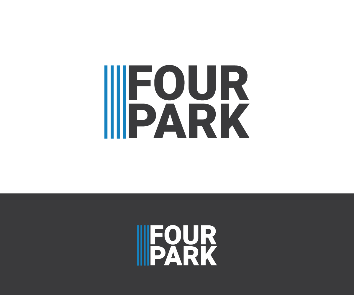
This customer received 83 logo designs from 53 designers. They chose this logo design from Rixes tay as the winning design.
Join for free Find Design Jobs- Guaranteed
-
 US$150
-
 83 designs
-
 53 designers
Logo Design Brief
We are consolidating multiple companies under one collective group. However, we need to maintain the same form and style across all of the entities. Included are the four logos we altered to see if it was possible to make each logo have a different embellishment or structure, but maintain the same overall harmony in terms of ratio of font size to total logo dimensions.
The current project involves taking the current logos, and then producing a single, "parent" logo for The FourPark Group, or the d/b/a FourPark (as we use currently).
We are looking for that redesign to either:
Option 1: Refreshes or restyles the current FourPark logo into something you believe can easily be reused or converted for use by the subsidiary entities (Hagemann Barnes, Barnes & Associates, and The Chamberlain Foundation). Each of the four logos must use the same colors and the same font, but might be oriented differently or feature a minor embellishment; OR
Option 2: Be “completely” different. In this case, although there could be radical changes, the logo still must adhere to a few ground rules. Those are as follows:
1. The logo must not use a “major” embellishment/bug (e.g,. adding a globe, outline of a park bench or something similar sitting to the left of the name). That said, it might look great if the “bar” in the logo was changed to a dotted line or was curved in some way. We are fine considering minor changes or embellishments (if needed, and not required).
2. We strongly prefer using an abbreviated company name (“nickname”) in the logo. The FourPark Group LLC changed to FourPark in our current logo. We do like that convention, but are open to other ideas. See The Chamberlain Foundation logo below. However, if you design the FourPark logo to use the whole name bear in mind that it must also be something you believe works for the other company logos as well. We either need to go with all nicknames, or all full names.
3. If the logo remains heavily dependent on color contrast, then note that we are in the financial services and investment banking sectors, and so neon green is not something like to work as a primary color. The primary color must be understated, but not overly conservative either. Ideally it is a color that can stand up over time.
Thank you for considering our logo reboot project. The winner is, of course, highly likely to obtain the work to refresh and harmonize the other company logos (if that is a question to anyone participating).
Logo Text
See the project description for details.