Corporate Logo Design Project

Want to win a job like this?
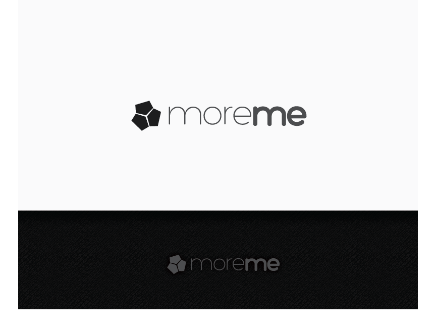
This customer received 100 logo designs from 31 designers. They chose this logo design from jaime.sp as the winning design.
Join for free Find Design Jobs- Guaranteed
Logo Design Brief
We need a logo design for a new company called 'moreme'.
The company is an online community market place for professional self development. So it brings together experts with large multinational companies to help develop their employees. Professional refers to self development that is relevant for business, not spiritual, life and other personal development. Our temp site is: www.moreme-company.com but a new and professional one is being made.
As such, it needs to appeal to 3 target audiences, in this order of priority:
1. employees in large corporations
2. multinational/large corporations
3. experts/professionals in personal development (coaches, mentors, etc).
This industry is one of little credibility, while our business will take a difference angle of being a trusted partner. Consequently the logo needs to have a highly corporate and trustworthy feel (think linkedin.com). At the same time, it needs to appeal to employees as a new and cool way to develop themselves. We would like employees to feel drawn into this business and take their company with them, and for the logo to have a personal touch (example, letters in logo hand-written) given it's a business where people work with people.
So in summary, a logo of a highly corporate feel, with a personal twist of 'cool' to make it something employees want to be part of.
The name is made up of 'more' and 'me', signaling that everyone in the triangle: corporation, employee and professional gains from this. The employee grows, so from his perspective, it is 'more me', the corporations gains from getting 'more' from their employee(s) and the experts/professionals providing the service gains more business and credibility through this business, i.e. again 'more me'. Maybe the logo illustrates this logic of gain for 'me'.
We would like for the logo to visually make 'more' and 'me' stand out from each other, while keeping them in one word (for example, different font color for each word - like designcrowd), so that the viewer will read it as more me.
The site will generally be made in light grey, white and blue. But we are open to a logo of a different color (purple, green, red,..) to give the site that personal and cool touch as long as it will fit into the overall corporate look of the page.
It will be a global network/community business, so an option to build this into the logo.
Industry/Entity Type
Industry
Logo Text
moreme
Logo styles of interest
Emblem Logo
Logo enclosed in a shape
Abstract Logo
Conceptual / symbolic (optional text)
Wordmark Logo
Word or name based logo (text only)