Logo Design Project-Massage Therapy Studio
Want to win a job like this?
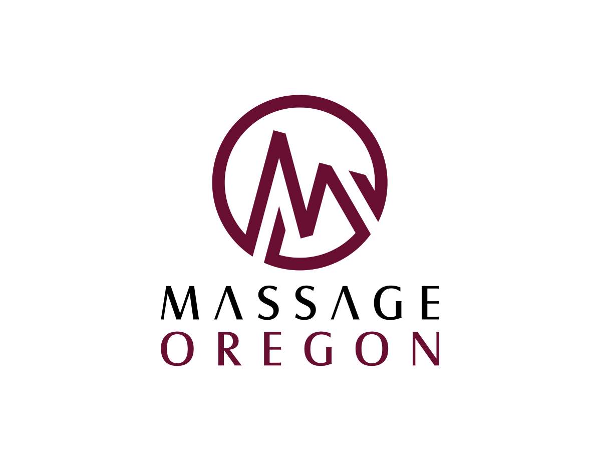
This customer received 112 logo designs from 26 designers. They chose this logo design from SylasGreen as the winning design.
Join for free Find Design Jobs- Guaranteed
-
 US$260
-
 112 designs
-
 26 designers
Logo Design Brief
We need a logo design for our existing massage therapy studio.
Owned and managed by two therapists with over 12 years experience, Massage Oregon is a Portland Oregon massage studio providing practice space for independent massage therapists and a variety of massage services for the surrounding community.
The logo will be immediately used for the following:
* website (massageoregon.com, currently in development)
* online marketing, social media.
* studio signage (A-frame at street, glass front door, in studio signage describing services and introducing therapists)
*easy to use B&W option for print material as well as 2-3 color option - Colors of studio currently include dark brown, golden yellow, warm orange, red, and green (light avocado).
The logo should appeal to:
Both men and women between the ages of 30-70 who choose massage as part of an ongoing health care plan for themselves and their family as well as a spontaneous treat.
They don’t depend on their health insurance to cover their care, but if they do, we can bill for them.
Educated, socially and environmentally conscious, conservative and liberal, middle to upper income bracket, our clients are often commuters that drive pass our studio every day and/or live nearby. As the decision makers and agenda setters in their household and the networkers in their immediate community, they value honesty, truth, and authenticity.
2) Potential renters. Experienced, business-minded massage therapists, mature and committed, confident in their own chosen set of techniques and skills with socially intelligent personalities. They help round out the public appeal of the studio and add to the cooperative, synergistic professional environment.
3) Doctors and other professionals in both allopathic and natural healthcare.
Updates
After looking at the entries we have realized that the bold "MO" is downplaying the power of the name Massage Oregon.
We would like to see more submissions where the design elements are part of the text of the name itself.
*M*assage *O*regon
We still welcome pretty design elements around the name. We are a wellness center so FRIENDLY & NATURAL design elements are strongly encouraged.
Added Sunday, June 10, 2012
Project Deadline Extended
Reason: need more time to pick between our top three. THANK YOU ALL SO MUCH for your hard work!
Added Friday, June 22, 2012
Project Deadline Extended
Reason: Need time to collect more feedback from clients.
Added Thursday, June 28, 2012
Target Market(s)
As described above, men and women, potential massage therapist renters, and healthcare providers.
Industry/Entity Type
Conservative
Logo Text
Massage Oregon
Logo styles of interest
Emblem Logo
Logo enclosed in a shape
Pictorial/Combination Logo
A real-world object (optional text)
Abstract Logo
Conceptual / symbolic (optional text)
Wordmark Logo
Word or name based logo (text only)
Lettermark Logo
Acronym or letter based logo (text only)
Look and feel
Each slider illustrates characteristics of the customer's brand and the style your logo design should communicate.
Elegant
Bold
Playful
Serious
Traditional
Modern
Personable
Professional
Feminine
Masculine
Colorful
Conservative
Economical
Upmarket
Requirements
Must have
- The words “Massage Oregon”.
Use of caps and spacing is up to the designer.
Easy to read and understand
Bold, natural elements/colors.
Nice to have
- Creative use of Oregon appropriate natural landmarks.
Either “M” or “O” From the words Massage Oregon to be utilized as a design element and/or the initials “MO” to stand alone with Massage Oregon written in small script.
Should not have
- Predictable massage elements such as hands, people getting massaged.
Overused components of nature: bamboo, lotus blossoms, leaves, or bonsai trees not too “woo-woo”.