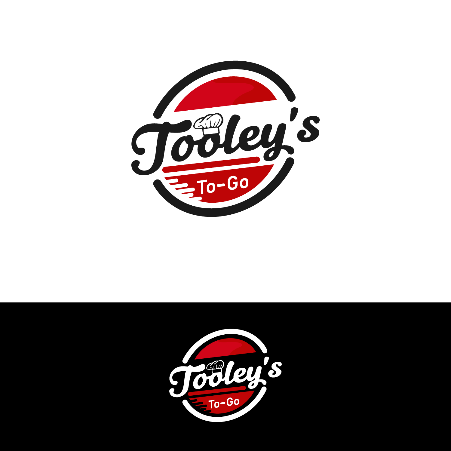
Tooley's To Go Logo for our food program
Want to win a job like this?
This customer received 78 logo designs from 38 designers. They chose this logo design from Ernest Owusu as the winning design.
Join for free Find Design Jobs- Guaranteed
-
 US$150
-
 78 designs
-
 38 designers
Logo Design Brief
We own and operate gas stations in Northern California and want to re-brand our food service program inside some of our convenience stores. We primarily serve pizza but also do sandwiches, fries, chicken wings and breakfast sandwiches, etc. Everything is take away/out as we do not have seating in most sites. This logo would be used on the menu board and stickers on the wrapped sandwiches, etc. The logo can be fairly simple but I would like the wording to have some depth to it. We do like the Tooley's above the To Go .
Updates
Need a couple of days before selecting a winner
Target Market(s)
Convenience store customers (highly male skewed)- 20-40 years old
Logo Text
Tooley's To Go
Logo styles of interest
Wordmark Logo
Word or name based logo (text only)
Font styles to use
Colors
Colors selected by the customer to be used in the logo design:
Look and feel
Each slider illustrates characteristics of the customer's brand and the style your logo design should communicate.
Elegant
Bold
Playful
Serious
Traditional
Modern
Personable
Professional
Feminine
Masculine
Colorful
Conservative
Economical
Upmarket
Requirements
Must have
- Something that conveys "hot food, good and fast"
Nice to have
- Depth to the wording and a fun font. It is a long saying so the "Tooley's" over the top of "To Go" would be nice. Open on colors but we often use red and grey/black