Landing page and nested content pages for NextDoorChristian.com
Want to win a job like this?
This customer received 36 web designs from 5 designers. They chose this web design from pb as the winning design.
Join for free Find Design Jobs- Guaranteed
-
 US$380
-
 36 designs
-
 5 designers
Web Design Brief
Web design for existing site https://nextdoorchristian.com/
This is a RESPONSIVE web site that needs to work on a medium-res mobile device and also look great on a widescreen desktop.
There are three or four public pages we currently have that need a fresh design, which will be used somewhat to guide the design direction for the non-public interior site for logged-in users in a later design effort.
The recently created new logo is attached and the new design should be based on this logo, I don't know how you'll do it, but the new logo should fit appropriately; the current web site's little logo on the top left must be thrown out, and one of our goals in this design effort is to set up the top nav bar, logo placement, etc. There are multiple logos attached to this project but the primary one to try for is the red door one. The other logos (gray+red arc logo and tree logo) are there in case you as the designer prefer them and can demonstrate that they are more suited for a web design than the red one. Otherwise I am hoping to see the red logo used for the site overall and the other logos to highlight discipleship and/or fellowship sections on the site.
The main pages are: 1) landing page, which describes the function of the site for logged-in users (not actually a part of this design project but the logged-in users' site redesign should be inspired by this effort) with multiple bits of content embedded on the page, and 2) a content page called "The Essentials" which contains several pages worth of content. The content is currently just a wall of text; it needs to be somehow broken down into clickable sections and imagery applied to make it interesting. 3) We also have some more minor pages which I'll list below.
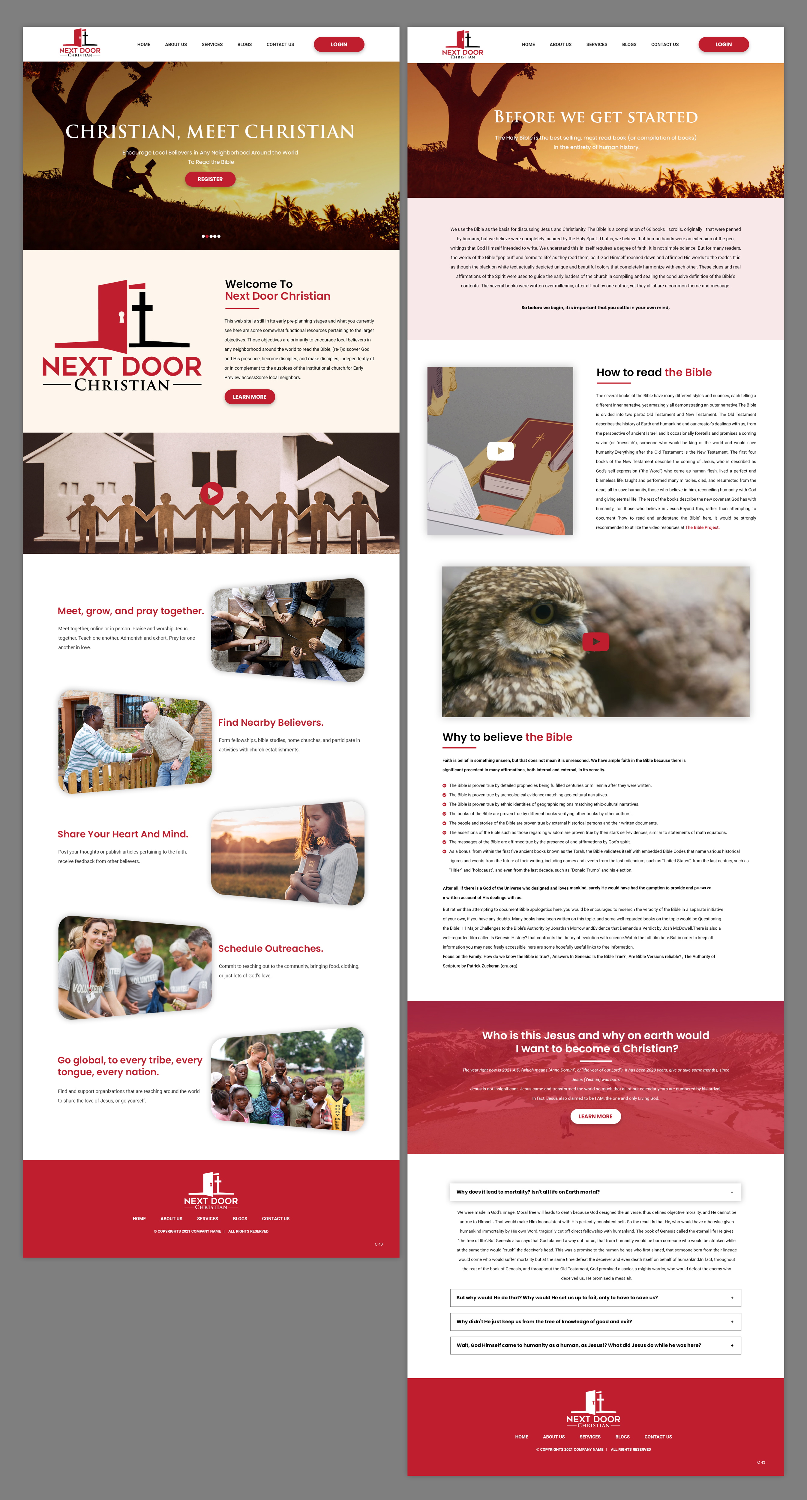
The Landing Page
This is to redesign the content at https://nextdoorchristian.com/
The current web site's placeholder content represents the general direction desired for the landing page, but I'm not a designer, so colors and layout etc can be totally re-thought. I'd like to use these images and these highlights. I've uploaded the stock images.
The web site on the whole for logged-in users (again, not itself a part of this design) is part social network and part library of various guides and resources. So the landing page needs to highlight the objectives of the site while demonstrating some of the features of the site. There is currently also some additional text content that should also be there, but should not be so prominently displayed as it is today; it should be accessible from some scrolling and/or from a button-click pop-over, so that new visitors are not inundated with a wall of text. Besides the logo, I've uploaded some features of the site that might be useful in graphically highlighting the features of the site.
'The Essentials' Content Page
This is to redesign the content at https://nextdoorchristian.com/Gospel
The content at this URL is currently one big wall of text, and it is intimidating enough that people may not be likely to read it. It needs to be read.
Other minor content pages
We also have these pages that needs to demonstrate a "theme" of basic content pages' design strategy for basic content:
https://nextdoorchristian.com/freebibleresponse
and
https://nextdoorchristian.com/bibledistribution
We will be adding additional content pages later, but we need to finalize the design theme before proceeding.
As currently demonstrated, I tend to prefer a serif font for headings (for theming around ancient-yet-current faith-based content), sans-serif for paragraphs (for readability), which is why the current site uses the fonts it has. Find some better fonts as you please.
The images prefixed with "interior-features-" are for landing page reference only, you might choose to highlight a cropped snippet, but don't go too crazy since these features will themselves be redesigned and so we will need to replace whatever cropped sample you might use with another one later.
There will be login and register functions. I DO NOT want any of this functionality to be built, but I do want the core public-site UX concept built out with *CLEAN* and attractive markup in HTML+CSS(+JS?) based on Bootstrap 4.
Target Market(s)
Christians looking for fellowship and discipleship outside of traditional church buildings (in-home fellowship, online fellowship, online study resources)
Coding
Coded - Design and coding required
Number of Pages Required
4 page
Font styles to use
Requirements
Must have
- Landing page entices the user to register
'Essentials' page somehow redistributes content into meaningful sections
Other minor content pages are redesigned but not too complicated, so that future content pages can follow suit
Designer can choose the logo out of 3, but the red door logo was the preferred logo if you can work with it and integrate it into the site such as with a responsive site top nav bar logo
HTML+CSS must be clean and based on Bootstrap 4