Real Estate company looking for fresh new design
Want to win a job like this?
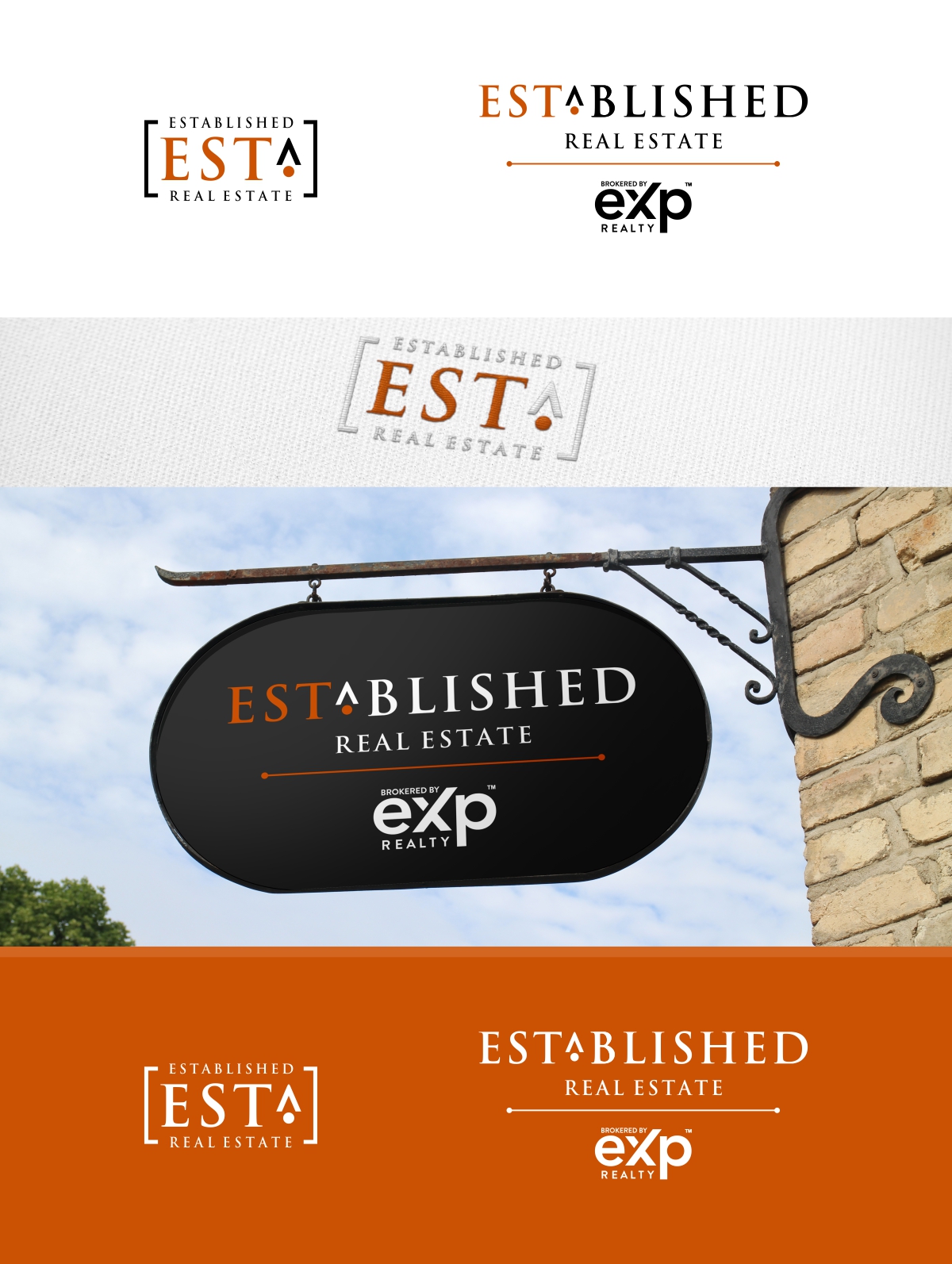
This customer received 118 logo designs from 51 designers. They chose this logo design from Artch4 as the winning design.
Join for free Find Design Jobs- Guaranteed
-
 US$150
-
 118 designs
-
 51 designers
Logo Design Brief
We want our real estate brand to look cool, hip, and fresh...yes it needs to say we are high-end and we are professional. We have ideas in mind of what the end result should look like, but we want your creativity to blow our minds and finish the idea. Couple of things to note about the design....
First, the company is Established Real Estate. The abbreviation for the word Established is: Est. You see on buildings all the time, and business, that an example this building or company was Est. in 1908 or Est, in 1968...etc. So as a part of the logo design, we want to include in the logo the Est. The Est design should be able to stand alone, and a part of the logo. Meaning the complete logo is the entire thing of Est. - Established Real Estate. But you could just separate the Est. logo as a standalone too. Make sense? That way we can use the Est. logo as a standalone item to put on stickers, hats, shirts, wall stickers, etc. The real branding is that Est. an abbreviation that is able to be a standalone look....and can be together as well with the entire full name of Established Real Estate. Again, as the name implies, we need to have the look feel like an Established real estate company look and feel as well, something with stature and professionalism, yet not boring. We help familes Establish a home together, or real estate agents Establish a career with us...and we are an Established company. Thus the name Established Est. Real Estate. As a side note, the words "Real Estate" are more of a placeholder so people know what the company does, those 2 words do not need to be the main focus.
I DO NOT want a logo of a house, or a key on the design. every real estate company has some cheesy house or key on it. Yuck!
We are open to coloring, but we are thinking white/black, with a touch of burnt orange and dark gray charcoal colors...but are open if you see some idea you want to run with.
Lastly, for compliance purposes in our state....we NEED to have this compliance logo included with out logo somehow, and it needs to somehow fit and look natural. This compliance logo states who our broker is, and the logo cannot be altered. It can be placed anywhere, and can be any size (meaning it can be small, but it still should be easily readable) but i has to be included in the design for state compiance purposes. The logo states: "Brokered by Exp". I will include the file here to be able to be used. again, it can be black, or it can be white, but you cannot alter the logo itself besides the size and ration in relation to our main Est. Established logo.
Here is a link to some design ideas that we like....again use your creativity:
https://www.evernote.com/shard/s159/sh/93792c0c-caf3-829c-f6d3-86f5f567da0d/150851cf887c828bf41f4921b5aae262
We really like some of these ideas and we were just playing around with a design pad, so it is low quality...but looking for something your creative and professional designs can show.
Logo Text
Est. - Established Real Estate
Logo styles of interest
Wordmark Logo
Word or name based logo (text only)
Font styles to use
Colors
Designer to choose colors to be used in the design.
Look and feel
Each slider illustrates characteristics of the customer's brand and the style your logo design should communicate.
Elegant
Bold
Playful
Serious
Traditional
Modern
Personable
Professional
Feminine
Masculine
Colorful
Conservative
Economical
Upmarket
Requirements
Must have
- The abbreviation for the word Established is Est. The design part of the Est. should be able to be seperated and stand on its own so we can use that for fun marketing, hats, stickers, apparel, etc.
Should not have
- NO logos of houses or Keys. I know people think, "oh a real estate company, must picture a house. Please don't