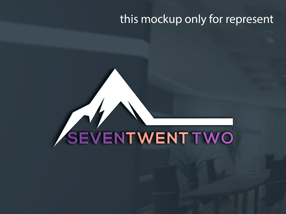
Seven Twenty Two and 722 is our brand
Want to win a job like this?
This customer received 78 logo designs from 38 designers. They chose this logo design from MH@Designer as the winning design.
Join for free Find Design Jobs- Guaranteed
-
 A$150
A$150
-
 78 designs
-
 38 designers
Logo Design Brief
Design a series of logos version using the below logo text options. We want various styles for various locations using the specific version for locations that suit the most.
Note:722 is my original motor cycle racing number that is blessed with great vibes and memories. We want to re use it with our family of racing riders celebrating it once again as a brand not a race number.
We see 80’s old school, retro, to modern fancy font with it spelt in a running writing style..
Target Market(s)
Major brands such as Specialised Bikes or similiar.
Industry/Entity Type
Mountain Bike community
Logo Text
722 and or Seventwentytwo and or Seven Two Two, a series of all types plus more ok
Logo styles of interest
Wordmark Logo
Word or name based logo (text only)
Font styles to use
Other font styles liked:
- Use number 722 old school feel, text for modern feel
Colors
Colors selected by the customer to be used in the logo design:
Look and feel
Each slider illustrates characteristics of the customer's brand and the style your logo design should communicate.
Elegant
Bold
Playful
Serious
Traditional
Modern
Personable
Professional
Feminine
Masculine
Colorful
Conservative
Economical
Upmarket
Requirements
Must have
- Must be fun and cool!
Nice to have
- The number 722. With an outline around it would sum up how hat logo could look. The text seven twenty two may be the side of a bike, truck or similiar brand location.
Should not have
- A boring feel.