Crooked Tower, Inc. Logo Design
Want to win a job like this?
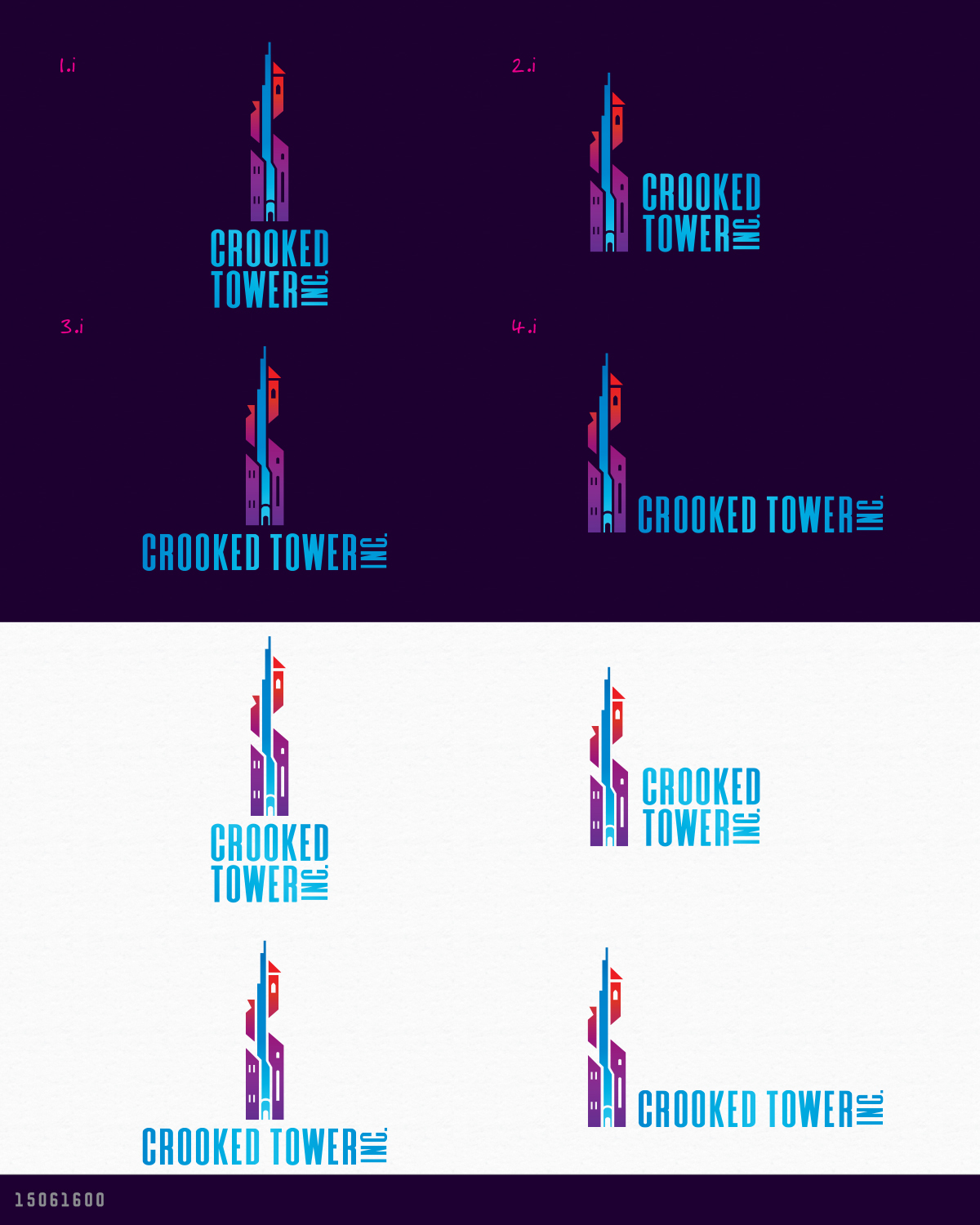
This customer received 145 logo designs from 49 designers. They chose this logo design from AD-X as the winning design.
Join for free Find Design Jobs- Guaranteed
-
 US$150
-
 145 designs
-
 49 designers
Logo Design Brief
Crooked Tower has a unique approach to branding: the company presents itself as a fictitious mad-scientist wizard research company, researching and developing new products. Think Acme, Inc and Aperture Science. The logo should reflect this fictitious mad-wizard research company. The 'Crooked Tower' is a fantasy wizard tower turned modern research-facility, and their headquarters.
In reality, Crooked Tower is an entertainment company. We develop and and publish board games, tabletop games, video games, novels, and other interactive media; with a focus on emergent discovery-based engagement.
The logo should be modern and slick, but indicative of creativity, like structured chaos. It should feature the eponymous 'tower' (the fictitious headquarters of the company).
(The logo can include or exclude the ", Inc." designator, at the designers discretion).
Target Market(s)
Gamers and readers from age 16 to 45.
Industry/Entity Type
Entertainment, Gaming, Publishing
Logo Text
Crooked Tower, Inc.
Logo styles of interest
Pictorial/Combination Logo
A real-world object (optional text)
Abstract Logo
Conceptual / symbolic (optional text)
Font styles to use
Look and feel
Each slider illustrates characteristics of the customer's brand and the style your logo design should communicate.
Elegant
Bold
Playful
Serious
Traditional
Modern
Personable
Professional
Feminine
Masculine
Colorful
Conservative
Economical
Upmarket
Requirements
Must have
- A depiction of the 'crooked tower', a building that combines the look of a modern research facility with a fantasy wizard's tower. The text for 'Crooked" and 'Tower' should have matching font styling.