Travel Health Brief Beautiful and Simple PDF design showing risks on your travels
Want to win a job like this?
This customer received 32 web designs from 10 designers. They chose this web design from Rabel K. as the winning design.
Join for free Find Design Jobs- Guaranteed
-
 £140
£140
-
 32 designs
-
 10 designers
Web Design Brief
Please see the attached PDF named "Pinpoint Travel Health Brief", and the document for the full brief for tis work.
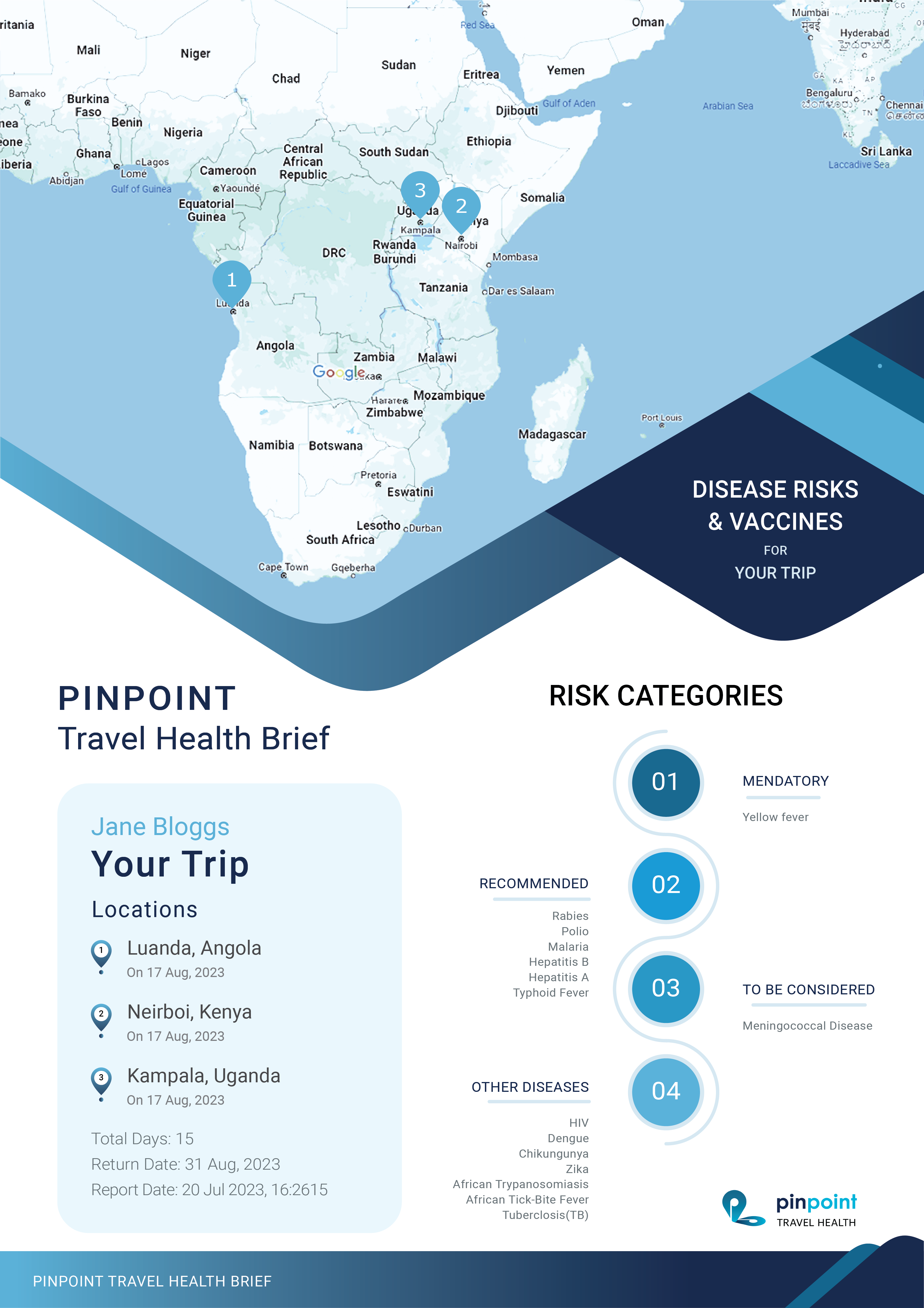
This document is a summary of a traveller's planned trip itinerary and any associated health risks from diseases and the related vaccines available. It is available for purchase once the traveller has provided us with information about their trip.
Although this document contains all the required content and the correct colour scheme, its design needs to be of a quality that reflects its purchase price. It would benefit from looking more attractive and for its data to be laid out in a way to make it more easily readable.
Target Market
Individuals, families and professionals looking to plan international travel.
Deliverables
The project will deliver a new design for the PDF in vector format (preferably a layered AI file), along with individual vector files for any illustrations created for the project.
Design Overview
This document will be displayed onscreen in HTML format so the design needs to work well for both print and web.
The design must follow the attached Pinpoint Travel Health brand book, we like the colour scheme we have and do not wish to digress too much from this.
The use of appropriate illustration and iconography is encouraged. These can add additional colours so long as these are complementary to the existing palette.
We will be looking for:
● Attractive layout
● Appropriate illustration
● Good use of whitespace
● Good choice of font size to denote information hierarchy
● Recognisably the same branding as the current sample document provided
Specific Notes on Content
The Your Trip section could contain 1 destination or many. The design must accommodate any number of destinations. It should be optimised to look best for trips of 1 to 3 destinations.
The design of the map pins cannot change.
The map is a static google map and will be using the colour scheme and map pins displayed.
This map can be a maximum image size of 640 x 640 pixels, but this can be stretched in the PDF - however if it's too big it will look blurry so the size it is now is about perfect.
One idea we have had is to include infographic summary data on the first page below the map/itinerary. Perhaps counts for each disease risk category.
The colours we have chosen for each disease risk category are not set in stone, but we want to avoid any sort of traffic light (red/amber/green) colours. You are welcome to stick with the existing colours.
The number of diseases in each section is completely dynamic. There could be, none, one or many, so the design needs to accommodate that without being too linear and boring a layout, like it is at the moment.
The example we've provided purposefully includes most of the diseases in question so you can see what the content looks like for each one.
The hyperlinks could theoretically be any length. We have left them as URLs rather than link text as the PDF document needs to be printable. In the onscreen version we use link text.
Updates
Low designer entries
Target Market(s)
Individual travellers researching the risk of foreign travel
Industry/Entity Type
Healthcare, travel
Look and feel
Each slider illustrates characteristics of the customer's brand and the style your logo design should communicate.
Elegant
Bold
Playful
Serious
Traditional
Modern
Personable
Professional
Feminine
Masculine
Colorful
Conservative
Economical
Upmarket
Requirements
Must have
- See brief
Nice to have
- See brief