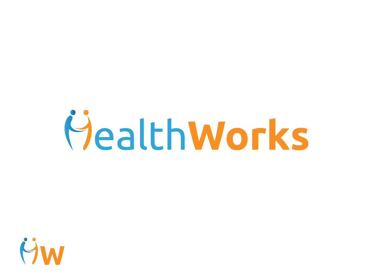
Logo design for Health site
Want to win a job like this?
This customer received 69 logo designs from 16 designers. They chose this logo design from kavish as the winning design.
Join for free Find Design Jobs-
 US$200
-
 69 designs
-
 16 designers
Logo Design Brief
We are HealthWorks, Malaysia's leading health community. We are a website that provides credible health information, health product choices and also a community space online. We inspire and empower people to make better choices for their health. We believe health should be exciting, easily understood, and taken seriously. We turn lengthy boring health articles into fun enjoyable ones! We take the bore out of health. We appeal to the mass, but our primary audience are the young busy people age 18 - 35.
We need a logo design called "HealthWorks"
We would like to see designs that use the base color Blue or Orange
The final design should communicate trust, credibility, fun and optimism. It should shout that "health really works!". It should give people a feeling that health can be exciting! Our site is backed by professional expert's advice, but tweaked in a fun approachable way.
We have added some samples of logos that we like.
Updates
Project Deadline Extended
Added Friday, February 07, 2014
Target Market(s)
Primary target: aged 18 - 35
Secondary: everyone
People who wants to improve their health through simpler, easier and fun ways.
Industry/Entity Type
Health
Logo Text
HealthWorks
Logo styles of interest
Pictorial/Combination Logo
A real-world object (optional text)
Wordmark Logo
Word or name based logo (text only)
Font styles to use
Other font styles liked:
- can try Museo Sans if it fits your design
Colors
Colors selected by the customer to be used in the logo design:
Look and feel
Each slider illustrates characteristics of the customer's brand and the style your logo design should communicate.
Elegant
Bold
Playful
Serious
Traditional
Modern
Personable
Professional
Feminine
Masculine
Colorful
Conservative
Economical
Upmarket
Requirements
Must have
- Blue OR Orange as primary colour. You can mix with neutral colours if you feel they fit.
We've selected the shades of blue/orange we like.
Nice to have
- Icons that are either beside, or part of the word (for eg: the "o" in the word "HealthWorks" to be tweaked as a cogwheel icon)