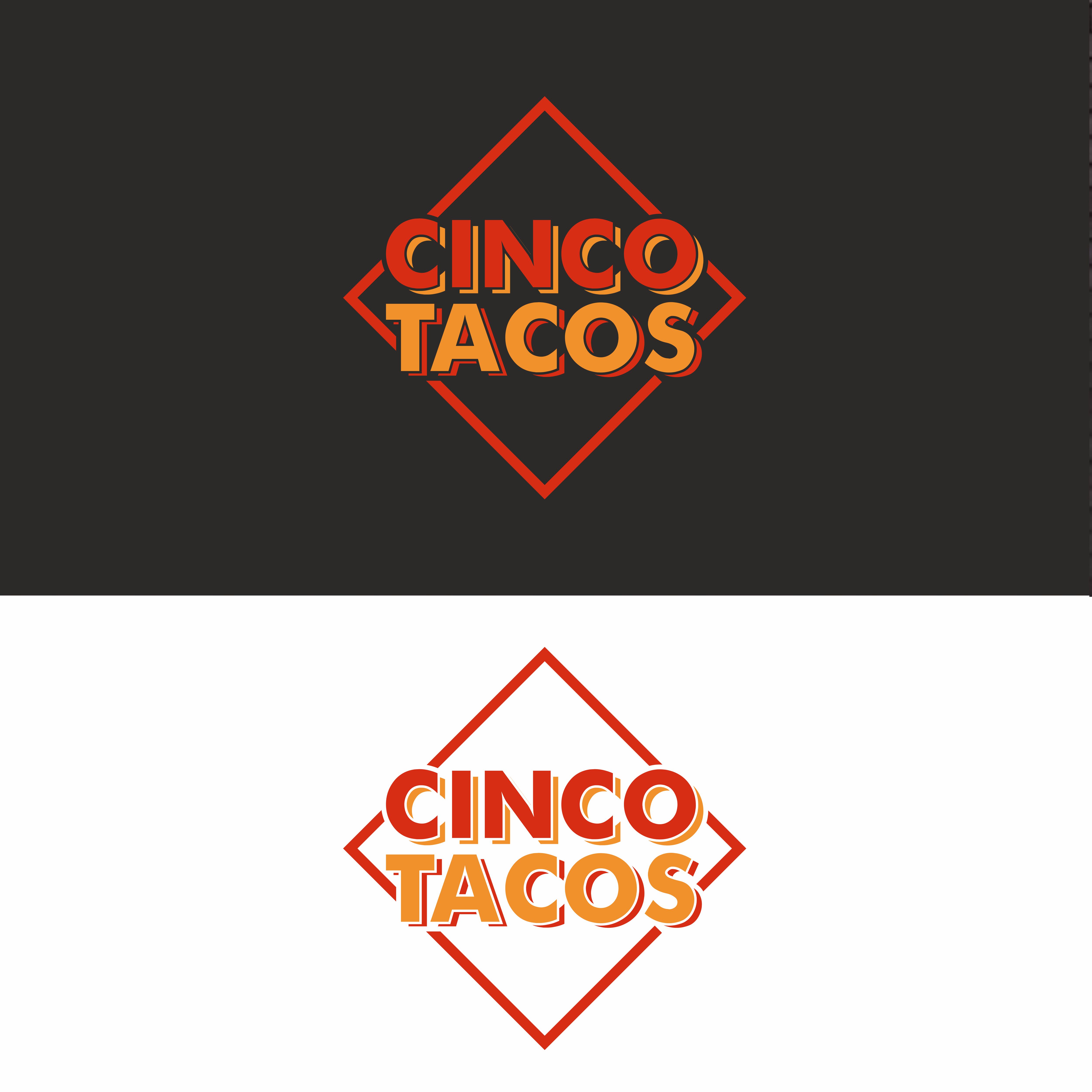
- RESTAURANT NAME - "CINCO TACOS"

Want to win a job like this?
This customer received 236 logo designs from 64 designers. They chose this logo design from RAZQ as the winning design.
Join for free Find Design Jobs- Guaranteed
Logo Design Brief
Cinco Tacos is a unique small restaurant concept inspired by the number five. Everything revolves around this theme: five taco options, five salsas, and a curated menu built for simplicity, quality, and flavor. The brand represents a modern take on authentic Mexican street food—vibrant, bold, and approachable.
The vibe of Cinco Tacos is fresh, clean, and contemporary, with an emphasis on minimalism and authenticity. The design should reflect a sense of structure and precision tied to the number five, while also evoking warmth and approachability.
We want the logo to feel timeless, without including direct imagery of tacos or food, to keep it versatile and sophisticated. Clean lines, balanced elements, and perhaps subtle nods to the Mexican culture (like geometric patterns or the use of color) are welcome but should remain understated. The focus is on creating a brand identity that is simple yet striking, with a modern edge that resonates with diverse audiences.
Target Market(s)
Young Professionals & Students: People looking for quick, affordable, and flavorful meals. Families: Offering a variety of options that appeal to both adults and kids. Foodies: Those who enjoy authentic, high-quality Mexican street food with a modern twist. Health-Conscious Diners: With vegetarian options like champiñones tacos and fresh ingredients. Casual Diners: People seeking a relaxed, fun dining experience in a Subway-style format.
Industry/Entity Type
FOOD, STREET TACOS, CASUAL DINNER
Logo Text
CINCO TACOS
Logo styles of interest
Emblem Logo
Logo enclosed in a shape
Character Logo
Logo with illustration or character
Wordmark Logo
Word or name based logo (text only)
Lettermark Logo
Acronym or letter based logo (text only)
Font styles to use
Other font styles liked:
- Mexico Rotulo Style
Colors
Colors selected by the customer to be used in the logo design:
Look and feel
Each slider illustrates characteristics of the customer's brand and the style your logo design should communicate.
Elegant
Bold
Playful
Serious
Traditional
Modern
Personable
Professional
Feminine
Masculine
Colorful
Conservative
Economical
Upmarket
Requirements
Must have
- FONT ROTULO STYLE.The font style on "rótulos de México" is typically characterized by a bold, hand-painted aesthetic with thick strokes and high contrast between thick and thin lines, often resembling a traditional sign painter's style, using fonts like Futura, Open Sans, or Helvetica with modifications to emphasize the hand-drawn look; this style reflects the art form of "rotulismo" which emerged in Mexico, where local artisans would create vibrant, often decorative signage for businesses, usually without formal design training, resulting in a unique visual language on the streets.
Nice to have
- keep it simple but at the same time fresh and modern
Should not have
- Tacos Images