New Equipment Rental Company Named Southwest Ohio Rentals Design
Want to win a job like this?
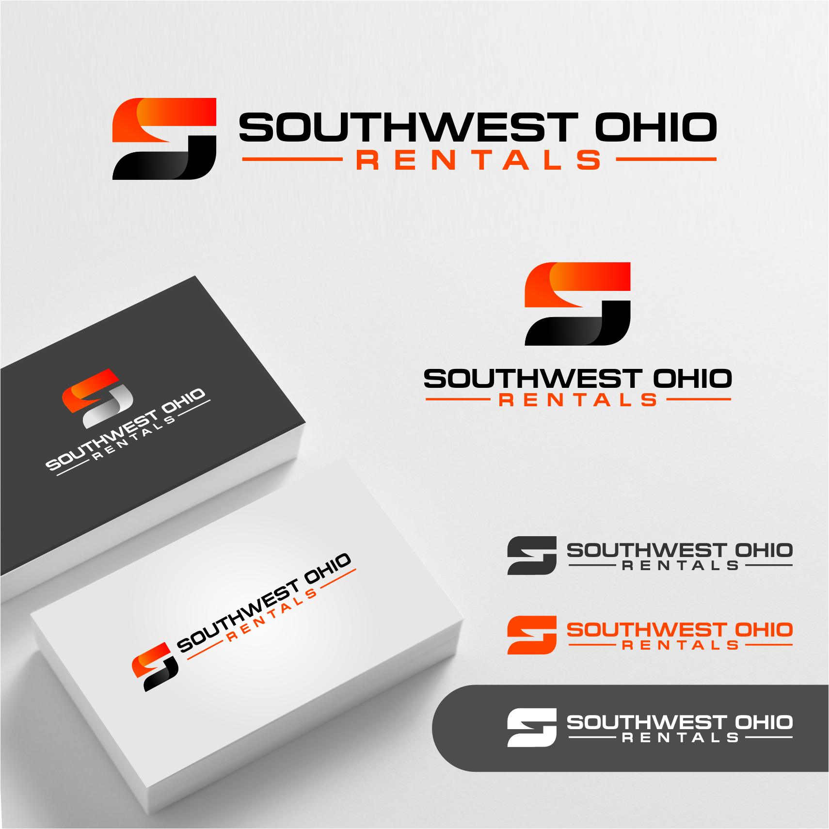
This customer received 109 logo designs from 46 designers. They chose this logo design from Arham Hidayat as the winning design.
Join for free Find Design Jobs- Guaranteed
-
 US$150
-
 109 designs
-
 46 designers
Logo Design Brief
Southwest Ohio Rentals LLC is a new rental company based in Southwest Ohio, offering a wide range of items for rent, including construction equipment (like tools and excavators) and event/party supplies (like tents and decorations). We serve both individuals and businesses, helping them with projects and celebrations. Our brand is about versatility, reliability, and community—we want to be the go-to rental solution for any need in our region.
This logo will go on the website, all marketing materials, buildings and heavy equipment. Thinking a text based logo might be best unless the designer can come up with an icon that works for the business.
Target Market(s)
Our target market includes: Homeowners and DIY enthusiasts in Southwest Ohio who need tools or equipment for home improvement projects. Small to medium-sized contractors and construction businesses looking for affordable equipment rentals. Event planners, families, and community organizations planning parties, weddings, or events who need supplies like tents, tables, and decorations. Essentially, anyone in Southwest Ohio who needs to rent items for work or celebration, from individuals to businesses, aged 25–60, who value reliability, affordability, and local service.
Industry/Entity Type
Rental Services (covering both construction equipment and event/party supplies)
Logo Text
Southwest Ohio Rentals
Font styles to use
Colors
Designer to choose colors to be used in the design.
Look and feel
Each slider illustrates characteristics of the customer's brand and the style your logo design should communicate.
Elegant
Bold
Playful
Serious
Traditional
Modern
Personable
Professional
Feminine
Masculine
Colorful
Conservative
Economical
Upmarket
Requirements
Must have
- My project must have: A clean, vector-based design that scales well for small (e.g., 1-inch-wide on a business card) and large formats (e.g., signage). An abstract symbol that represents access, connection, or opportunity
Nice to have
- Explore other abstract shapes if they fit the theme of access or connection (e.g., a stylized "S" for Southwest, a keyhole, or a bridge).
Should not have
- Overly literal imagery (e.g., detailed tools, excavators, or party supplies like balloons or hats) as the main focus—we want a general, abstract design. Complex or overly detailed elements that won’t scale well on a business card. Playful or cartoonish styles—we want to feel modern and professional, not childish. Cold or harsh color schemes (e.g., neon colors or stark black-and-white without warmth). Sharp, aggressive angles in the design—keep shapes soft and rounded for an inviting feel.