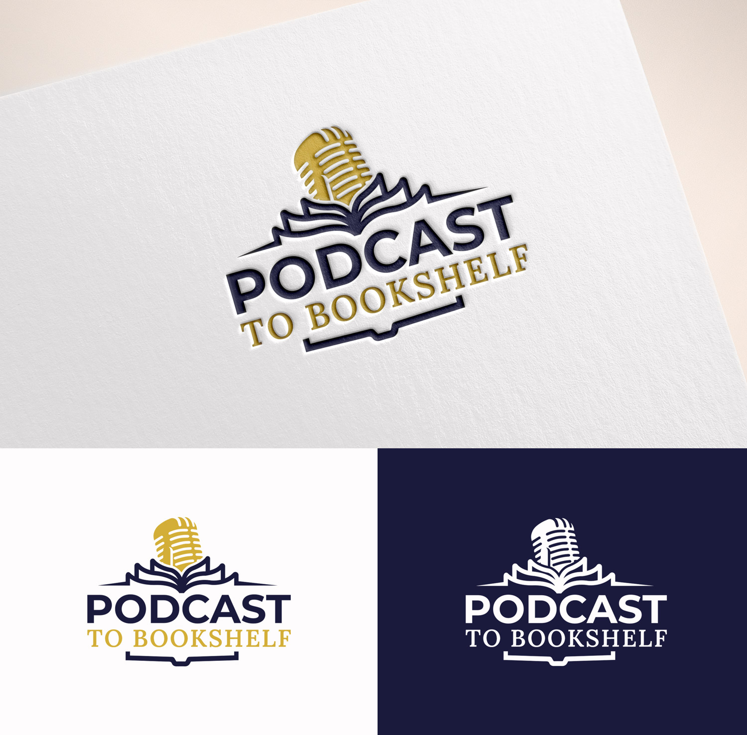
Podcast to Bookshelf Logo

Want to win a job like this?
This customer received 122 logo designs from 63 designers. They chose this logo design from M Art & Design as the winning design.
Join for free Find Design Jobs- Guaranteed
Logo Design Brief
Podcast To Bookshelf is where spoken legacy becomes lasting literature.
This brand doesn’t shout.
It speaks with clarity, confidence, and depth.
It’s where the wisdom behind the mic (someones podcast) is honored, elevated, and made tangible — in beautifully crafted books that carry messages into rooms, hands, and hearts.
This is not a trendy self-publishing service.
It’s a curated, elegant, intuitive experience for thought leaders, teachers, and visionaries who are ready to make their message permanent.
Look + Feel
Visual Tone:
Elegant but not delicate
Professional but personal
Editorial, timeless, and grounded
Imagine the aesthetic of a modern literary imprint or boutique publishing house — something you'd see on the spine of a bestselling book at Indigo or featured in Harvard Business Review or The Atlantic.
Think “luxury publishing meets intuitive brand elevation.”
Emotional Tone:
Safe but bold
Intimate but impressive
Quiet confidence (never flashy)
Embodies “I didn’t know I needed this until now.”
It should feel like being seen by someone who really hears you — and being guided into legacy with care and precision.
Colors should be muted but rich, layered, and spacious — nothing overly saturated or high-contrast. The feel should breathe.
Deep Indigo / Ink #1A1A3D
Elegant Cream / Pearl White #FAF8F1
Brushed Gold Accent #D4AF37
Muted Rose Quartz (optional accent) #D6B5B5
Typography Direction
Primary Typeface: Playfair Display
For logo, titles, and main headers — evokes classic publishing, editorial sophistication, and credibility.
Secondary Serif: Lora or Libre Baskerville
For taglines, quotes, or supporting text — modern but still literary in feel.
Accent Sans-Serif: Montserrat
For clean UI elements, buttons, or digital headings — adds contrast without stealing the tone.
Typography should reflect elegance and clarity, never overly decorative. The words are doing the heavy lifting.
Audience Vibe
Your clients are:
Podcasters who know they have a book in them — even if they can’t name it yet
Thought leaders, coaches, consultants, speakers, and spiritual entrepreneurs
People who want their message to last, their voice to evolve, and their wisdom to be held
They’re not chasing fame.
They’re creating meaning, momentum, and movement.
They want the process to feel intuitive, guided, and aligned with their essence.
Target Market(s)
See description
Industry/Entity Type
Media
Logo Text
Podcast to Bookshelf
Logo styles of interest
Emblem Logo
Logo enclosed in a shape
Pictorial/Combination Logo
A real-world object (optional text)
Abstract Logo
Conceptual / symbolic (optional text)
Font styles to use
Look and feel
Each slider illustrates characteristics of the customer's brand and the style your logo design should communicate.