Kawaii illustration adapting logo for punk rock t-shirt
Want to win a job like this?
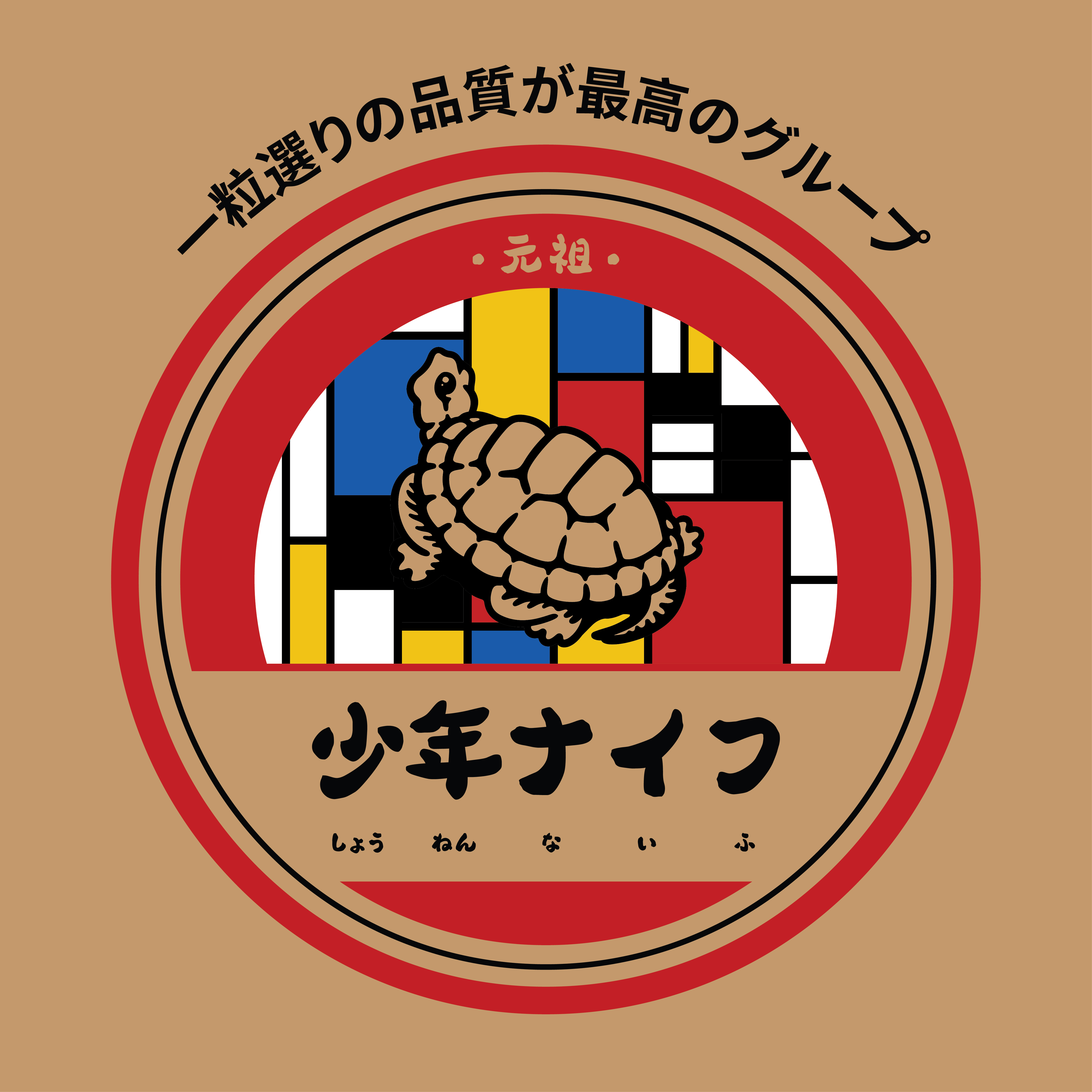
This customer received 38 illustration designs from 13 designers. They chose this illustration design from utsukushiitsumi as the winning design.
Join for free Find Design Jobs-
 US$110
-
 38 designs
-
 13 designers
Illustration Design Brief
Looking for a mash-up of a logo with Mondrian, to be placed on a t-shirt.
Background: The band is Shonen Knife, a fun all-female Japanese punk/rock band that has been playing for 40+ years. They describe themselves as cute but dangerous. They have a song Tortoise Brand Pot Cleaner about a particular scrubbing brush, kamenoko tawashi. They also have their own costumes fashioned after Piet Mondrian paintings.
The goal of this design is to mash up the logo from the scrubbing brush with the Mondrian aesthetic, and have the panels on the tortoise from the logo have Mondrian colors.
Song: https://www.youtube.com/watch?v=beG7-moCgDA
Product reference: https://shop.kamenoko-tawashi.co.jp/c/kamenoko/kamenokotawashi-white-1
Company reference: https://www.kamenoko-tawashi.co.jp/
Requirements:
Overall desired vibe is kawaii: cute, fun loving, uplifting.
The design should read as the original logo. It can be a straight color change of the original, but that's unlikely to look cohesive, and I think a redrawing of the original will look much better.
Tortoise, if redrawn, should read as the original, and be drawn in a kawaii style. The panels of the tortoise should have a Mondrian pattern of colors.
Colors for the non-tortoise elements should match the original reference logo.
Attached photo of the reference logo has a yellow background. Delivered file should have a transparent background, with a background layer with the same yellow color so it can be hidden if desired for the final product. The logo will be printed on a black or yellow t-shirt.
Illustration should include the red and black semicircles and circles surrounding the main logo. They don't need to be clones of the original, but the overall logo should read as the original.
Illustration should include the following text based on the reference image:
一粒選りの品質が最高のグループ (outside the outer red circle)
元祖 (in the inner red circle)
少年ナイフ (instead of 亀の子束子)
and under the characters for 少年ナイフ, in a small font:
しょう under the 少
ねん under the 年
ないふ under the ナイフ
少: しょう
年: ねん
ナイフ: ないふ
Delivery format: vector format (.ai)
Look and feel
Each slider illustrates characteristics of the customer's brand and the style your logo design should communicate.