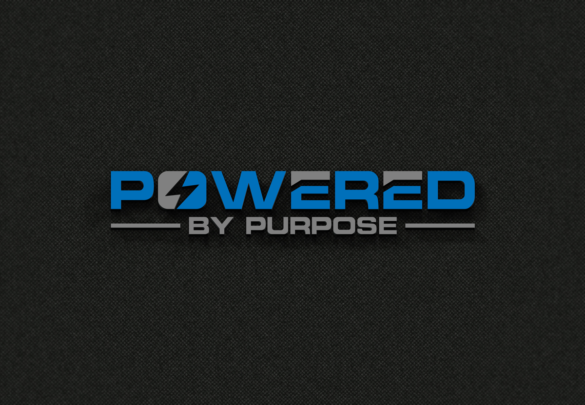
Marketing Campaign Logo for an Electric Company

Want to win a job like this?
This customer received 288 logo designs from 122 designers. They chose this logo design from Art Master logo as the winning design.
Join for free Find Design Jobs- Guaranteed
Logo Design Brief
Design a LogoDesign a restrained, purpose-driven wordmark for the Powered by Purpose campaign for an electric power cooperative. The logo should feel grounded in the electric utility space, communicating reliability, continuity of service, and responsibility to the communities served. Avoid anything that feels consumer-tech, startup-driven, or renewable-specific.
Incorporate a subtle energy-related element directly into the lettering. This element should be integrated into the typography itself, not presented as a standalone icon, and should remain understated and functional rather than illustrative.
The overall design should be clean, confident, and timeless. This mark will be used consistently throughout the year across core cooperative work, including system operations, safety, reliability, outage response, and community engagement. The logo should reinforce trust and intention, supporting the story that delivering electric power is essential work guided by purpose, not just a service provided.
Grayscale, no gradients.
Target Market(s)
member-owners of a locally governed electric cooperative, including residential, agricultural, and small business members who rely on dependable electric service and value community stewardship, ages 30+, midwest USA values
Industry/Entity Type
Energy
Logo Text
Powered by Purpose
Logo styles of interest
Emblem Logo
Logo enclosed in a shape
Wordmark Logo
Word or name based logo (text only)
Font styles to use
Colors
Designer to choose only greyscale colors for use in the design.
Look and feel
Each slider illustrates characteristics of the customer's brand and the style your logo design should communicate.