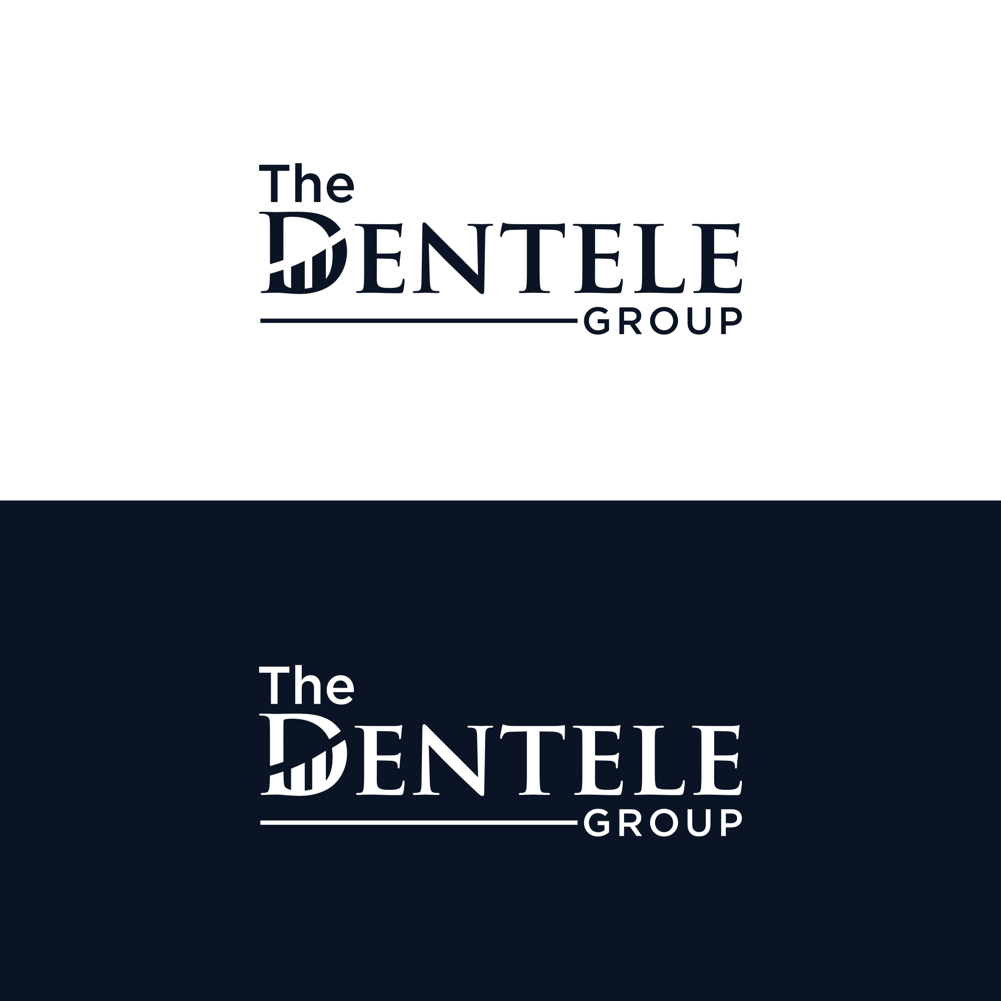
Leading Recruiting Agency Logo Redesign

Want to win a job like this?
This customer received 790 logo designs from 283 designers. They chose this logo design from ni9 as the winning design.
Join for free Find Design Jobs- Guaranteed
Logo Design Brief
The Dentele Group is a boutique, high-touch recruiting and advisory firm serving the dental industry. We are seeking a refined logo redesign that reflects authority, trust, sophistication, and strategic partnership.
This logo will be used across our website, LinkedIn, pitch decks, proposals, podcasts, and future products. The brand should feel elevated and modern, not clinical or transactional. We want something that signals we work with decision-makers and leaders, not entry-level recruiting.
We are open to wordmark-only or wordmark + subtle icon concepts, as long as the execution feels premium and timeless.
Prefer a refined, elevated palette — open to designer recommendations.
Historically aligned with:
Deep violet / plum tones
Black, charcoal, or warm gray
Soft metallic or neutral accents
Avoid bright, primary, or overly playful colors.
Target Market(s)
Dental industry companies that are hiring: Dental practices and DSOs Dental technology startups Dental manufacturers and vendors Executive and leadership teams
Logo Text
The Dentele Group
Logo styles of interest
Wordmark Logo
Word or name based logo (text only)
Look and feel
Each slider illustrates characteristics of the customer's brand and the style your logo design should communicate.
Elegant
Bold
Playful
Serious
Traditional
Modern
Personable
Professional
Feminine
Masculine
Colorful
Conservative
Economical
Upmarket
Requirements
Must have
- Premium, modern, and professional aesthetic Clean, legible typography that works well digitally A logo that conveys credibility, authority, and trust Scalable for LinkedIn, website headers, presentations, and print Works in both full color and black/white Feminine-forward but not soft, trendy, or decorative
Nice to have
- A subtle nod to elevation, growth, or leadership (abstract, not literal) Creative exploration of the letter “D” (e.g., negative space, structure, movement) A secondary mark or icon that could be used for social media or brand assets A design that feels influencer-ready without being flashy
Should not have
- No tooth icons, dental tools, or obvious dental imagery No generic recruiting symbols (magnifying glasses, people icons) No overly rigid, masculine, or corporate-cold designs No trendy fonts that will feel dated quickly No clip art or stock-logo aesthetics