Create a flyer / brochure for our School Reporting offering
Want to win a job like this?
This customer received 19 flyer designs from 8 designers. They chose this flyer design from SAI DESIGNS as the winning design.
Join for free Find Design Jobs- Guaranteed
-
 A$110
A$110
-
 19 designs
-
 8 designers
Flyer Design Brief
DESIGNER BRIEF
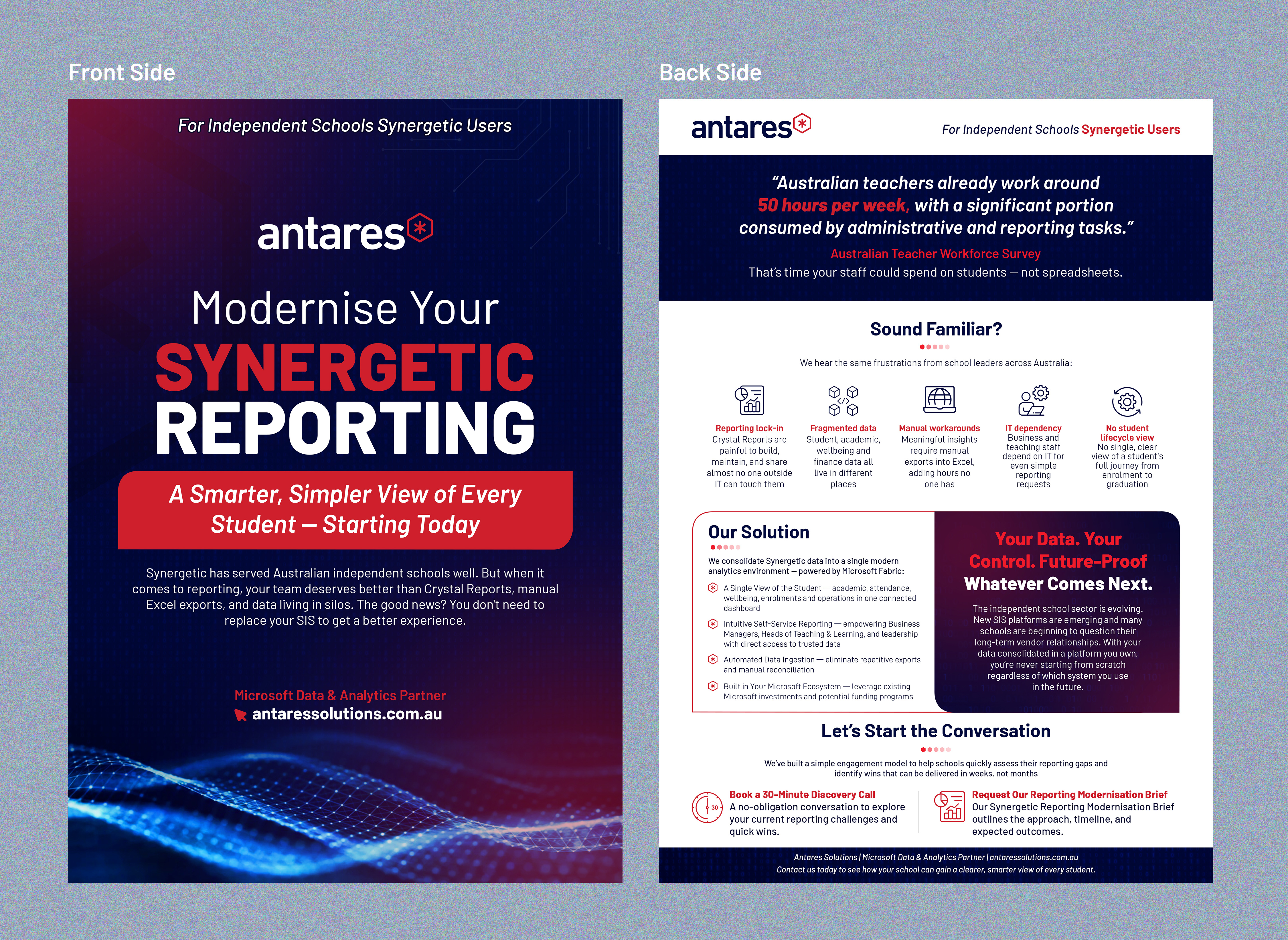
Synergetic Reporting Modernisation Flyer
Antares Solutions | February 2026 | Digital PDF & Web
What this brief covers
This brief provides everything a graphic designer needs to produce a polished, on-brand one-page flyer for Antares Solutions. It covers the strategic context, audience, brand guidelines, layout direction, copy structure, and delivery requirements. The Word document draft is attached as a content reference — the designer is expected to reimagine it visually, not simply reformat it.
1. Project Overview
Purpose
Antares Solutions is targeting Business Development Managers, IT Directors, and school leadership teams at Australian independent schools that currently use Synergetic as their Student Management System (SMS). The flyer is a conversation-starter — a leave-behind piece or email attachment designed to generate interest in a 30-minute discovery call or a follow-up Reporting Modernisation Brief.
The Core Message
“You don’t need to replace Synergetic to get better reporting. You just need to own your data.”
2. Audience & Tone
Target Audience
The reader is a senior leader at an Australian independent school — most likely a Business Manager, Director of IT, Head of Teaching & Learning, or a Deputy/Assistant Principal. They are time-poor, pragmatic, and slightly sceptical of vendor promises. They know Synergetic well and have lived with its reporting limitations. They are not necessarily technical.
Tone of Voice
• Confident and direct, not salesy or hyperbolic.
• Peer-to-peer, as if a trusted advisor is talking to them, not a vendor pitching.
• Solutions-first: acknowledge the pain briefly, pivot quickly to capability and outcomes.
• Professional but human — avoid sterile corporate language. Approachable and clear.
Emotion to Evoke
Relief. Recognition. Quiet confidence. The reader should feel: “this gets it — and they can actually help us.”
3. Brand Guidelines
Brand Reference
Website: https://antares.solutions
Antares positions itself as a specialist Microsoft Systems Integrator with deep expertise in Data, AI, and Modern Workplace. The brand is polished, technically credible, and modern — not flashy. The visual language should feel like a premium Microsoft partner, not a generic IT reseller.
4. Layout Direction
Visual Style
Clean, structured, and data-confident. Think ‘Microsoft partner pitch deck’ meets ‘premium B2B fintech’. The design should not look like a school newsletter or a generic IT flyer.
Key visual principles:
• Strong typographic hierarchy — the reader’s eye should be pulled through the page in a deliberate sequence: headline → stat → pain → solution → CTA.
• Dark header band (Navy) with the Antares logo and a clear flyer category label to anchor the brand immediately.
• Generous white space — do not crowd the page. Breathing room communicates confidence.
• Subtle geometric accents (thin lines, corner marks, or background shapes in Navy or Blue at low opacity) can add depth without overwhelming the content.
• Avoid stock photography of classrooms or teachers — if imagery is used, prefer abstract data visualisation graphics, Microsoft Fabric iconography, or clean architectural/grid patterns that suggest technology and structure.
• Iconography: use simple, clean line icons (Microsoft Fluent icon style preferred) to accompany the solution benefit points.
5. Copy Reference
The full copy for this flyer is contained in the attached Word document: antares_synergetic_flyer.docx. The designer should use this as the definitive source of all text content.
Key copy elements the designer should treat with particular visual care:
• Headline: “Modernise Your Synergetic Reporting” — this is the anchor. Never break it across two lines if possible.
• Subheadline: “A Smarter, Simpler View of Every Student — Starting Today”
• Stat: 50 hours per week — treat the number as a graphic element, not inline text.
• Future-proof headline: “Your Data. Your Control. Future-Proof — Whatever Comes Next.” — treat as a mission-statement-style banner.
• CTA buttons: “Book a 30-Minute Discovery Call” and “Request Our Reporting Modernisation Brief”
Do not edit, paraphrase, or rewrite any copy without approval from Antares Solutions.
6. What to Avoid
• No clip art, generic stock photography, or low-resolution imagery.
• No bright red, orange, or green — these colours are not part of the Antares palette and will undermine brand consistency.
• No gradients that feel ‘Web 2.0’ — if gradients are used, keep them subtle and in-palette (e.g., Navy to deep teal at low opacity).
• No all-caps body copy — only acceptable for short label tags.
• Do not use Comic Sans, Impact, or decorative fonts (this should go without saying, but just in case).
• Do not replicate the Word document layout — the Word file is a content reference only. The visual design should be created from scratch in a professional design tool.
• Do not add content or claims that are not present in the approved copy document.
7. Delivery Requirements
Files to Deliver
• PDF (RGB, screen-optimised) — primary delivery format for email and web download.
• PDF (CMYK, print-ready) — in case the flyer is ever used as a physical handout.
• Source file (Adobe InDesign .indd, Illustrator .ai, or Figma link) — so Antares can make minor copy edits internally in future.
• Font files or licence confirmation for any non-system fonts used.
• Image assets folder — all linked images/graphics at full resolution.
Naming Convention
AntaresSolutions_SynergeticFlyer_v1.0_YYYYMMDD.pdf