Logo Design for Carnival Game “Beat the Clock
Want to win a job like this?
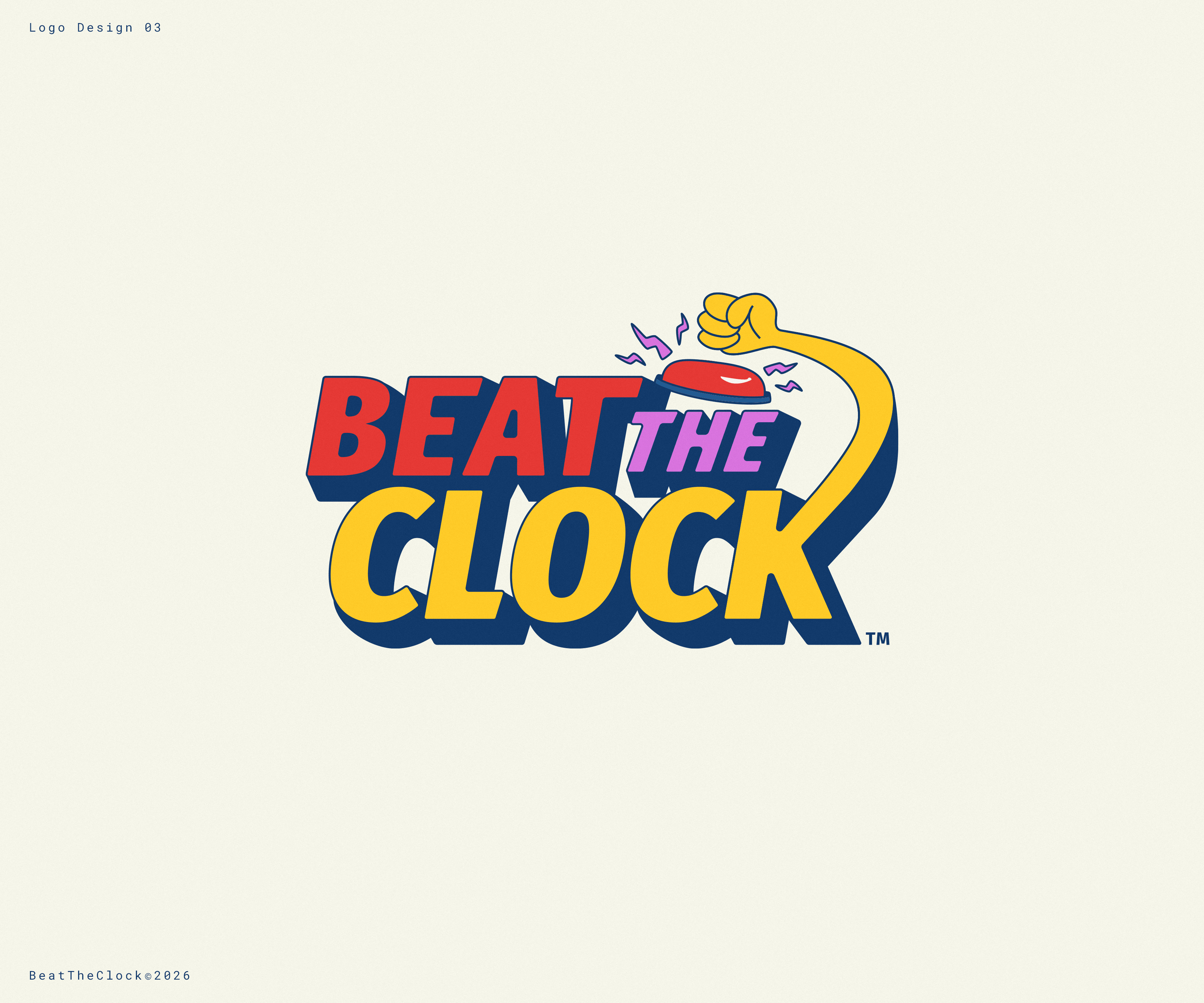
This customer received 77 logo designs from 40 designers. They chose this logo design from GBDESIGN as the winning design.
Join for free Find Design Jobs- Guaranteed
-
 €110
€110
-
 77 designs
-
 40 designers
Logo Design Brief
About the Game:
Beat the Clock is a fun and energetic carnival / fair game. Players press a buzzer and try to stop the timer exactly at **10 seconds**.
If a player stops exactly at **10.00 seconds**, they win the **main prize**.
If they stop very close (for example **9.95–9.99 seconds**), they win smaller prizes.
The game is loud, colorful, exciting and competitive – exactly the type of attraction you would see at a **carnival, fair, or festival**.
---
**Target Audience:**
Visitors at carnivals, fairs, festivals and amusement events:
• Families
•Teenagers
• Adults
The logo must be **very eye-catching** to attract people walking by.
---
**Logo Style:**
We are looking for a **Retro Arcade / Carnival Style logo**.
Inspiration:
• 1980s arcade games
• carnival/fair booth signs
• neon carnival lights
• arcade machine graphics
The logo should feel **fun, energetic, loud and playful**.
---
**Elements that could appear in the logo
**Colors:**
Strong carnival colors such as:
• red
• yellow
• blue
• neon pink
Optional:
• neon light effects
• glowing LED effects
• carnival-style lighting
The logo should work well with **light effects at night**.
---
**Typography:**
• big
• bold
• highly readable
• arcade / carnival style
• playful and dynamic
The logo must be **easily readable from 20–30 meters away**.
---
**Where the logo will be used:**
• carnival booth / fair booth
• LED lighting signs
• banners
• game displays
• social media
• merchandise
---
**Important:**
The logo should communicate **fun, excitement and competition**.
People should immediately understand that this is a **fun carnival game**.
---
**What we do NOT want:**
• minimalist corporate logos
• serious business style
• modern tech startup style
• thin or hard-to-read fonts
• boring colors
The logo should feel like a **classic carnival game attraction**.
Target Market(s)
Carnivals, fairs, festivals and amusement events in Europe. Visitors include families, teenagers and adults who enjoy fun carnival games and attractions.
Industry/Entity Type
Entertainment / Carnival Games / Amusement
Logo Text
Beat the Clock
Font styles to use
Colors
Colors selected by the customer to be used in the logo design:
Look and feel
Each slider illustrates characteristics of the customer's brand and the style your logo design should communicate.
Elegant
Bold
Playful
Serious
Traditional
Modern
Personable
Professional
Feminine
Masculine
Colorful
Conservative
Economical
Upmarket
Requirements
Must have
- Big bold text "Beat the Clock" • Retro arcade / carnival style • Very visible from far away (20–30 meters) • Bright carnival colors • High energy / fun feeling
Nice to have
- Digital timer or countdown numbers • Lightning or energy effects • A buzzer button • Neon or LED light effects • Motion / speed feeling
Should not have
- Minimalist corporate logo • Thin or hard-to-read fonts • Serious business style • Modern tech startup look • Dark or boring colors