Blue Tuna Spearfishing Icon Mark Project
Want to win a job like this?
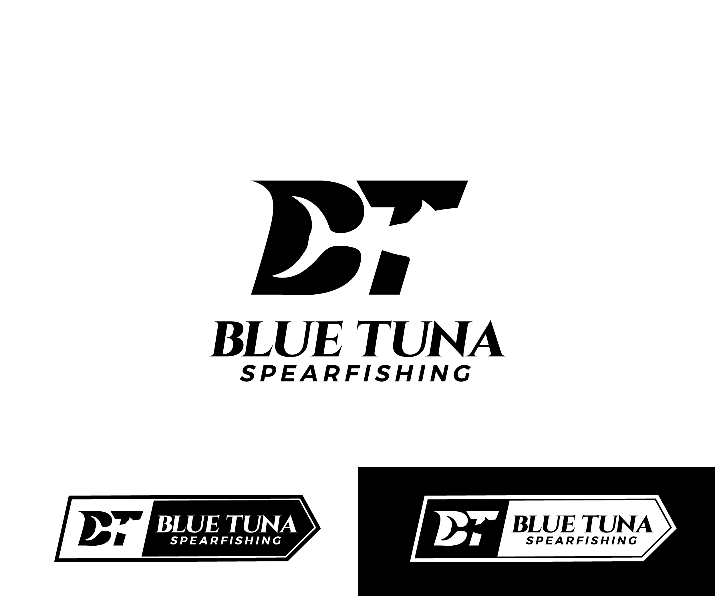
This customer received 7 logo designs from 3 designers. They chose this logo design from James J. as the winning design.
Join for free Find Design Jobs- Guaranteed
-
 US$110
-
 7 designs
-
 3 designers
Logo Design Brief
Blue Tuna Spearfishing is developing a minimalist symbol logo that can function as a secondary brand mark across apparel and accessories. This icon will complement the primary Blue Tuna Spearfishing logo and serve as a compact visual identifier for the brand.
The symbol should reflect the freedive spearfishing lifestyle and integrate subtle references to the brand through letterforms or ocean-related elements. The design should be clever, simple, and recognizable, with strong balance and geometry so it works well at very small sizes.
This icon will primarily appear on:
The back of hats
Sleeve cuffs of shirts
Chest hit on apparel
Inside larger logos
Small woven labels or tags
Equipment branding
The mark should feel modern, bold, and timeless, representing the precision, and ocean connection of freedive spearfishing.
Design Direction
The symbol should subtly incorporate one or more of the following elements.
Brand Letter Concepts
BT
BTS
Interlocking or abstracted letterforms
Letterforms hidden within shapes
Spearfishing / Ocean Concepts
Fish silhouette
Tuna tail
Speargun shaft
Trident
Freedive fins
Anchor (we have previously used anchors in our branding)
These elements should not look literal or cartoonish. Instead, they should feel abstract, geometric, and integrated into a single clever mark.
Design Requirements
Black and white only
Must invert cleanly for light or dark garments
No gradients
No thin details that disappear at small sizes
Must work at 1–2 cm embroidery scale
Strong silhouette recognition
Balanced proportions suitable for embroidery, screen print, and woven labels
Style References
The icon should feel similar in philosophy to marks used by premium outdoor brands like:
Salty Crew
Kalletka
Patagonia