

 Refresh
LOGO DESIGN FOR SUV TRUCK WHEELS CENTER CAP
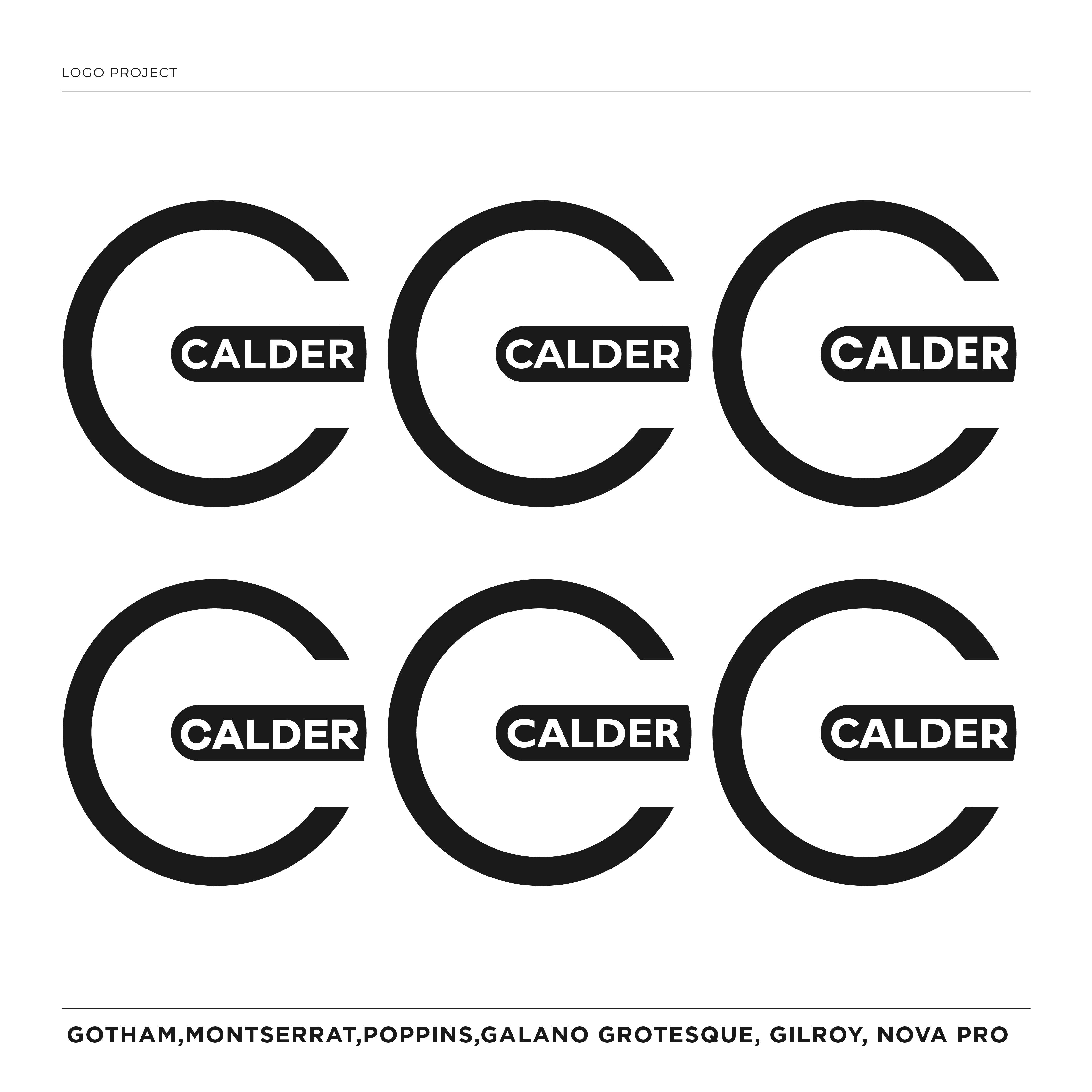
Want to win a job like this?
This customer received 1096 logo designs from 283 designers. They chose this logo design from abdul700 as the winning design.
Join for free Find Design Jobs
-
 US$490
-
 1096 designs
-
 283 designers
Logo Design Brief
LOGO DESIGN BRIEF
CALDER
Bold performance-luxury · For submission to DesignCrowd
About the Brand
Calder is a bold performance-luxury wheel brand for trucks and SUVs. We make two-piece flow-formed wheels — strong, beautifully engineered, hand-finished, made to order in limited runs. Our buyer wants presence and energy: a wheel that turns heads and signals success, with real quality behind it. Think the confident, high-energy end of premium— bold and modern, but never cheap or gaudy. Our edge is energy with craft.
What We Need
A primary wordmark logo for the name CALDER, plus a standalone emblem/mark (important — see below). Delivered as a horizontal lockup at minimum.
The Feeling We're After
Bold, confident, modern, high-energy — with taste. The logo should have real presence and look strong on a truck, in a feed, and on a center cap. Premium performance, not luxury-quiet and not budget-loud. It should feel like a brand that has arrived and knows it.
Wordmark Direction
— CALDER in all capitals, with a strong, modern, confident character.
— A bold sans-serif with real weight and presence. Distinctive letterforms welcome — a custom or semi-custom feel, not a stock font.
— It can have edge and energy, but must stay legible and refined enough to read as premium. Strength and precision, not chaos.
Standalone Emblem / Mark (Important)
We want an ownable abstract mark — most likely built from the letter C — that can stand alone on a wheel center cap, packaging, and social avatars. Directions to explore:
— A distinctive, bold monogram “C” with motion, edge, or dimensionality.
— An abstract geometric mark suggesting strength, motion
— It must be simple, powerful, and instantly recognizable at small sizes.
The mark should feel modern and confident — something that looks great embossed on a cap or enlarged on a banner.
Colors
— Primary: deep graphite / near-black
— A bold metallic or single strong accent is welcome — brushed silver/chrome, or one confident accent color (e.g. a restrained bronze/gold, or a single bold tone). Keep the palette tight: one accent, not many.
— Must also work in solid black and solid white (single-color versions).
Please Avoid (Important)
— No dragons, animals, mascots, or any creature emblems.
— No “dragon scale” / oriental-dragon motifs (overused in commodity rims — we are not that).
— No speed lines, motion streaks, or cheesy racing cliches.
— No wings, shields, flames, gears, or literal wheels/rims drawn into the logo.
— No chrome gradients or glossy 3D bevels that look dated or low-end.
— No thin, delicate, “fashion-quiet” treatments — this brand has energy.
— No sci-fi / techy / gaming fonts (no clipped corners, no futuristic letterforms).
— Nothing that looks like a cheap aftermarket or mass-produced rim brand.
The Balance to Strike
Bold and high-energy on one side; premium and tasteful on the other. If it looks timid, it's wrong. If it looks cheap or garish, it's wrong. We want the confident middle: strong, modern, expensive-looking energy.
Usage
Website header, wheel center caps (small, often single-color), premium packaging (possibly embossed), a numbered plate/certificate, social media and merchandise. Must stay strong and legible when small and in a single color.
Deliverables
Horizontal wordmark lockup; a stacked/secondary version; the standalone emblem/mark; and single-color black and white versions.
CALDER

Updates
WE WANT TO USE THIS LOGO FOR OUR CENTER CAPS OF OUR WHEELS, NEEDS TO BE ROUND AND BOLD
Added Monday, 22 June 2026
Designs look the same
Target Market(s)
MALE 20-60
Industry/Entity Type
AUTOMOTIVE
Logo Text
C and a second version CALDER
Logo styles of interest
Emblem Logo
Logo enclosed in a shape



Lettermark Logo
Acronym or letter based logo (text only)



Font styles to use


Colors
Designer to choose colors to be used in the design.
Look and feel
Each slider illustrates characteristics of the customer's brand and the style your logo design should communicate.
Elegant
Bold
Playful
Serious
Traditional
Modern
Personable
Professional
Feminine
Masculine
Colorful
Conservative
Economical
Upmarket
Requirements
Must have
- MUST BE ROUND
Nice to have
- A POWERFUL C
Should not have
- TOO MANY COLORS